Monday, December 12, 2005

I'm OFF!!!


In just a few hours, I'll be leaving for the airport. Above is a map of where I'm going. Tralee in the lower left, in red, is where I'll be. It's nestled right in the bay, so it is sure to be very cold there. The blue dots are all the printshops that I know of in Ireland. I might find out that there are more.

I'll be gone for a month, and I'm not sure what kind of access I will have for the internet. The internet cafe's are very expensive, but maybe I'll sneak into the library every now and then.

I'm taking a lot of books with me, and a sketch book too, so I'm hoping something will come to me while I'm there. I watched the Magdalene Sisters for the first time the other night, and it just ignited a rushing river of images in my head. It seems that I should tap into this subject matter more since it had such an impact on me.

So Merry Christmas, Happy Holidays, to you all!!!

Sunday, December 11, 2005

Cork Printmakers


So, this guy in the foreground is someone I have to meet. Anyone with crazy-cool hair is an automatic atraction magnet for me. Cork is about two hours away from where I'll be in Ireland, so I must also check out this print shop. My brother is applying to UC-Cork, so we'll have to spend a few days together checking out this city. I'm interested in how this printshop integrates classes into the community.

Cork Printmakers are committed to promoting print as a public art form. We provide a professional, open access, fine art print workshop so as to facilitate printmakers and visual artists working through the medium of print. A range of presses, tools, equipment and materials, required to produce a body of work, are available to members.

As well as supporting artists, Cork Printmakers has a substantial role to play in the community. Public engagement is very important and so the workshop is very active in the exhibition of print in public and private spaces and embraces critical response. In addition, we offer the most comprehensive range of printmaking courses for adults in the country and through our artists in schools programme, which won an AIB Better Ireland Award, we bring the art of printmaking to children between the ages of six and eighteen, across all social backgrounds.

Crown Point Press


Last week I visited the Crown Point PressWinter exhibit. I didn't realize that the printshop was just around the corner from the SFMOMA, so I stopped by to take a peek. I was so ecxited because Crown Point Press has such a great reputatioin. A lot of famous artists go to crown point press to turn their work into intaglio prints. I wasn't particularily drawn to anything I saw, but It was pretty exciting being there. There were tons and tons of drawers with past porfolios in them. If you ask them to look at the prints, they give you pretty white gloves to flip through the prints. I asked to get a tour of the printshop, but the tour guide was busy. The woman told me to come back during the week when I can actually see people pulling prints off the press. That's extremely exciting. I kind of sneeked into the printshop anyways, and it seemed so huge. I'll have to go back after I get back from Ireland, and get a better view.

Crown Point began in 1962 as a print workshop, but started publishing prints in 1965 with etching porfolios by Richard Diebenkorn and Wayne Thiebaud. It functioned as both workshop and publisher until 1971 when Brown formed an alliance with the New York publisher, Parasol Press. In that year Crown Point Press moved from Brown's Berkeley basement to a loft space in downtown Oakland, and --through Parasol Press-- began working with New York artists Sol LeWitt, Brice Marden, and others who would later be seen as key members of the Minimal art movement.In 1977 Crown Point Press shifted its emphasis back to its own publishing program, and began working with a group of mainly Conceptual artists including Vito Acconci, Chris Burden, Tom Marioni, John Cage, and Pat Steir. Artists published by Crown Point since that time represent a wide variety of contemporary art approaches, and many of them live in countries other than the United States. Art historian Susan Tallman in her 1996 book, The Contemporary Print, describes Crown Point as "the most instrumental American printshop in the revival of etching as a medium of serious art." From 1982 through 1994 Crown Point added Asian woodcut techniques to its etching program, taking artists to Japan, and later China, to work with craftsmen in those countries. ince 1986 Crown Point Press has been located in San Francisco, where it has a gallery open to the public and two large etching studios. With a staff of twelve, the press currently publishes etchings by five or six invited artists a year. It also holds summer workshops open to all artists.

I'll really want to take a summer workshop next summer, so hopefully the classes will not be full.

Thursday, December 01, 2005

My friends

Here are a couple links to my friends at CCA. Both Weston and Michelle were in my class. I'm kind of sad that I don't get to see them much. Michelle is in the printmaking program and we had studios next to each other. We shared a bathroom and kept booze in the shower. It's amazing to see how their work has progressed in the past semester. I really need to crack the whip on myself. As soon as I get back from Ireland, I'm going to have to fully submerge myself into producing art. I've spend the last few months researching, sketching, thinking, but I now need to take all that is within myself and explode onto paper. I really need to get stuff done, and push myself more. I was looking back on my sketch books from the beginning of my grad experience and have realized how much my mind has grown, and my artistic sense has grown. I feel a lot more confident about contemporary art. I feel like I understand things a lot more now, and wont feel like an ousider. I'll be ready to go back as long as I make work!

WestonTeruya


Michelle Carlson

Wangechi Mutu

Another one of my favorite artists is coming to the San francisco MOMA. I am absolutley curious to see her work in person. I've been told that I should encorporate collage into my printmaking, but I'm never satisfied with the way it looks. Wangechi Mutu uses a lot of collage in her work succesfully. Her work is jewels for my eyes, and curiosity for my brain.


Friday, December 16, 2005 - Sunday, April 02, 2006

Wangechi Mutu, a Kenyan-born artist based in New York, makes luscious yet unsettling pictures of female figures. Her painted and collaged works on Mylar function as potent social critique while simultaneously exploring more poetic strains of mythology and allegory as well as the sensuousness of form, color, and pattern. Particularly interested in myths about gender and ethnicity that have long circulated in Africa and the West, Mutu has adopted the medium of collage — which by its nature evokes rupture and collision — to depict the monstrous, the exotic, and the feminine. Her exhibition at SFMOMA combines works on paper and a site-specific installation.

Tuesday, November 29, 2005

Limerick Printmakers

When I go back to Ireland, I'm going to visit the Limerick Printmakers printshop. Unfortunately, it looks like they are not offering any workshops while I'll be there. I'm looking forward to meeting the founders of the shop, and seeing what Irish printmakers are up to, and what they are thinking about. I mostly am looking for advice on opening up a printshop.

In July 1999 Limerick Printmakers was set up by three BA printmaking graduates from the Limerick School of Art and Design, Claire Boland, Kari Fry and Melissa O’Brien. Limerick City Enterprise Board gave Limerick Printmakers a start up grant in the form of Irl £12,000 to buy equipment and cover initial overheads.


Considerable support came from numerous people and organisations including the Printmaking Department at Limerick School of Art and Design (L.I.T.), Des Mac Mahon, Dietrich Blodau, Charles Harper; Mary Parkes at the Limerick Adult Education Centre; Cork Printmakers; The Graphic Studio; The Blackchurch Print Studio; Limerick Network Enterprise; Sheila Deegan, Limerick City Council; and Joe Buckley, owner of the premises.

In 2003 Limerick Printmakers received their first revenue funding from the Arts Council/An Chomhairle Ealaion. This revenue funding has been continued and increased in 2004 with an additional minor capital grant for equipment and again increased in 2005.

Yosemite and Tofurky


Thanksgiving was great this year. Yosemite National Park is just beautiful. It was so great to get out of the city and and spend time in the wilderness just being. My most favorite part of the trip was hiking up to Vernal waterfall. It was a very steep and busy trail, but when I got to the top, it was just breathtaking. The most fun part was when Tim and I climbed across the rocks at the opening of the waterfall to the otherside. We climbed off trail up the side of a mountain and ate our lunch in the sun.
It was a great time for Tim and I to take time out and talk about our relationship and reminisce about fun times. We will be going back again in the spring next year to do some more hiking. The only problem was when we got back, my mischevious little cat wrecked the apartment. Everything was knocked off the shelves, plants were spilling out of their pots, papers and books were chewed...just a great big mess. All I could do was laugh. It was pretty funny. Oh, yes I also had my first ever Tofurky. It was fine, but it just tasted like a ball of stuffing. Thanksgiving is a great holiday. It's great that families just get together for a grand dinner without the gifts and commercialization of other holidays.

Monday, November 21, 2005

Going Home

It's official; I'm going to Ireland December 13 for a whole month. I'm so excited because I have not been to Ireland for Christmas since I was very young. I'm hoping my parents will have a house by then. So far I got a message from my mom saying something about cows inhabiting a house they were interested in. I'm more excited to go back this time because there is so much more that I want to do than ever before. I've been reading these two books


Saints, scholars, and Schizophrenics: Mental Illness in Rural Ireland
by Nancy Scheper-Hughes


This book is so funny yet very sad. It's the study of a small Irish village in the 1970's not to far from where I grew up. The author is an American woman who tells tales about her and her families experience as an outsider in a very strick, small Catholic run village. A lot of the problems she comes across are issues that I have faced as a teenage "wannabe" yankee being brought up at home with the strict Irish Catholic 1970's values of my parents which never made sense to me. I wouldn't have minded but for the fact that my dad was an aetheist all of my childhood, but then along with moving to a new country somehow he adapted the Catholic faith. The only way he knew how to practice being a Catholic was from the insane rules he had as a child in the 1960's. Those are the rules he stuck to all through my adolescent "fun" years. The other problem is that during our absence from Ireland, Ireland was developing and evolving into a different Ireland. An island less on the ball and chain of the church and more on the road to a greater richer Ireland. So a lot has changed. If I had stayed in Ireland my family would have evolved along with others of their generation and not held on to these time capsuled ways. Although, I'm pretty sure if I had stayed in Ireland I would be knocked up with three kids by now, and a husband with no job. I think I'll take the troubled teenage years I had and live with it. So this brings me to the other book I am reading.


A just Society?
Edited by John Scally


It is a book with a bunch of essays on the ethics and values in contemporary Ireland. These essays are written by the best scholars in Ireland, and they pose a lot of difficult questions. If you have been reading my blog, you will have remembered my interest in Irelands new identity, and the problems it is creating. Although I am pleased Ireland is not run by the Catholic church I feel like a lot of problems are occuring because there is not any other value system being put in place. It is so hard to read newspapers about my countries problems with drugs, suicides, alcohol abuse, murders, racism, vandalism, and the such. It's difficult to see sprawling new houses being build and the landscape/enviroment not being taken care of. But on the good side more children are able to go to college, more people have health care, people own their own houses, better wages, communities are getting a face lift, more employment.....and this is where the debate comes in. How can the good things combat the bad??? It's a very interesting book.
When I go back, I want to observe what I have read for myself and apply it to my art. I'm also very interested in folk tales and am wondering how society can learn the from their olf folk tales, as they have learned from the Catholic values on how to live a just life. My thoughts seem a little jumbled right now, and probably don't make sense, but it will become more clear with time.

"You can tell a good man by how he treat his horse."

Sunday, November 20, 2005

Kiki Smith and Chuck Close


Yesturday I went to the SFMOMA and saw Chuck Close and Kiki Smith. They were at the museum to sign their books. I was so excited that day. The book I ordered online "Prints, Books, and Things" did not come this past week, so I bought a different book that goes along with her exhibit at SFMOMA. The line was about two hours(?) long, but I waited only half an hour because a woman came through the line asking for people who only needed Kiki Smith to sign the book. Most people were there for Chuck Close and it made me think a bit about the commercialization of art. His art was on posters everywhere all over San Francisco. I enjoy Chuck Close, but I can relate more to Kiki Smith. Anyway's the woman took me passed everyone and straight up to Kiki Smith. All of a sudden I felt like I had stage fright and time slowed down considerably. After she signed my book I sat down in a chair in front of both of them, and took a load of pictures. It was exciting, am I a nerd or what? After sitting there for a while staring at them, I left and went to the exhibit. I've never seen Kiki's work in real life, and was amazed at her work. The space was just perfect and I walked smoothly through the exhibit taking time to look really close at her prints. Most of her work was sculptural which is what she became famous for. I must say her work is much better in real life than in a book. I was drawn to the loose way in which her paper works were displayed. A lot of her work is printed on handmade japanese paper and just hangs off the wall. So soft and delicate, but her work was layered with heavy content. I enjoyed the sculptural bits which were on the floor infront of the prints. It was just so great to be there.
This was a Chuck Close piece that I enjoyed looking at. It shows his process of printing a nine plate color etching. The top row goes from pink to brown. The bottom row is each color plate printed in succession. Each plate was just a bunch of scribbles which in the end turned out to be a color portrait of Chuck Close. It was fascinating to me. I did get tired of Chuck Closes work by the end and went back to Kiki Smith's work to see anything that I might have missed. After looking at thier work, I went through the rest of the museum and was happy to come across Frida Kahlo's work. There is not very much of her work in Europe. Also, I saw a Chris Ofili painting which was exciting. I tried to smell the elephant dung, but it didn't smell at all. I left the museum feeling exciting and full of ideas.

Thursday, November 17, 2005

Double Elephant Printshop

I've never mentioned my dream before. I guess I had it nestled in my heart now for so long and daydream way too much about it. A couple years ago, I was lucky enough to stumble upon Double Elephant printshop while I was working in the South of England. It was the first printshop I had experienced outside of a university setting. I knew exactly at that time of my life that I wanted to commit myself to printmaking. It was the humblest of places I have ever been to in my life. If you know me well, you know that being humble, living humble is an important part of my life. It's a trait I have always admired. Simon and Lynn were the two founders of the shop...the most honest to goodness people I have ever met. I immediatley fell in love with the way they lived. The printshop was nestled in the back alley of a cobbled street. The building was two stories tall and made out of old red brick built by a crippling old man who had eighteen kids. The door was made out of wood, and if you peeked between the cracks real close you could just see the beginnings of a press. Going in through the doors you immediatley get hit by a musty smell, and that old recognisable smell of sweating paper and chemicals, but chemicals of a different sort. The shop happens to be an environmentally friendly printshop where rosin is replaced by acrylic medium, asphaltum is replaced by floor wax, and dirty dutch mordant replaced my ferric chloride. Strange new smells and strange new techniques. What captured me the most about Simon and Lynn was their commitment for reaching the community. This printshop was small and humble, but it spread its energy to other places such as schools, nursing homes, disabled people. This was the answer to all my questions...what good is art??? why do we need it??? am I wasting my time??? No, I am not wasting my time, art matters to people. I still believe that the properties of art come from a mysterious place. Such a dreamer...a silly dreamer. Anyways, this is my goal. I want to open my own printshop (with a little help from a friend(s)?) and give to the community. I often get very frustrated with public school art programs especially in the elementary level. As a kid I was so lucky to have great teachers who encouraged my learning process through creating objects, drawing, and painting. Not a day would go by without me doing something artistic. My little sisters come home with construction papered santa clauses and I just about freak out. I'm also frustrated with talented highschoolers in Oakland who don't even give college a second thought. I'm frustrated with the midwests love affair with Thomas Kincaid, people in old peoples homes with nothing to do, mentally challenged people who never get respect, and coco the gorilla trying her hardest to communicate with us (just kidding on that one). Honestly, I'm young and maybe have a "save the world complex" times one hundred, but I'm bursting with energy that needs to be put to good.

Below is a little bit more about Double Elephant and the website too.


Simon Ripley

Lynn Bailey

Double Elephant Print Workshop is an open access community based printmaking workshop based in Exeter. We have been established since 1997.

We run courses, promote exhibitions and provide open access to equipment for printmakers. We have resources for screenprint, etching, relief print and other processes. We run courses for special needs groups, in professional development and we outreach to schools and other communities. The workshop is run by Lynn Bailey and Simon Ripley.

You can contact us on 07855 206659
or through our web site www.doubleelephant.org.uk

Double Elephant was supported by ALIAS over three years with business planning, marketing and finance. We were also involved in the pilot scheme for ALIAS.

Sunday, November 06, 2005

Art on Paper Nov/Dec 2005


Wilson Shieh,
Baby,
color direct gravure with aquatint, spitbite, aquatint, and Ganmpi paper chine collé

I'm about to run out of the door and pick up this month's "Art on Paper". It's their second annual print edition.

The Year in Prints, Second Annual
prints by:
Mary Lee Bendolph / Enrique Chagoya / Shoshana Dentz / Tony Fitzpatrick / Ellen Gallagher / Trenton Doyle Hancock / Carrie Moyer / Shaun O’Dell / David Row / Ed Ruscha / James Siena / Wilson Shieh / Dana Schutz / Carolyn Swiszcz / Richard Tuttle / Kara Walker / Andrea Zittel

Thirty-five years ago, it would have been unlikely to walk into a collector’s home and find limited edition prints hanging in the company of paintings. Prints were considered the affordable offspring of contemporary art; people acquired them because they did not have the money to buy unique artworks by their favorite artists. Today things are changing and collectors acquire contemporary art with less regard to a particular medium. Still, we think it is instructive to single out prints as a sub-genre of contemporary art because the world to which they belong is full of fascinating contradictions. Technically, prints can be both inventive and arcane, incorporating the latest digital discoveries while making great use of such primitive processes as woodblock carving. Socially, they are simultaneously elitist and populist. Originally developed to ensure the widespread proliferation of images and ideas, fine art prints are now generally published in small editions of between ten to thirty impressions. For our Second Annual New Prints Review, we looked at more than 175 submissions from 81 publishers and workshops. The prints we considered were all published in the United States between September 2004 and September 2005 and adhere to the traditional definition of printmaking: they were printed through the transfer of an image from a matrix or plate to paper (i.e., lithographs, silkscreen prints, etchings, etc.). We selected seventeen for inclusion here, which is less than ten percent of what we reviewed. With regard to publishers and workshops, there are many whose prints were included last year that do not have prints included this year; several whose work is appearing for the first time; and a few that are represented by two prints, in part, because we are particularly excited about the artists they are working with right now. Although there is a lot of deserving work that is not here, we believe that the pages that follow provide a representative overview of some of the highlights of the year. —The Editors

Saturday, November 05, 2005

Amy Cutler


Amy Cutler is finally coming out with her own book. It's not out until May 2006, but it's already on the top of my list of books to buy.

Amazon

Product Details
  • Hardcover
  • Publisher: Hatje Cantz Publishers (May, 2006)
  • Language: English
  • ISBN: 377571734X
  • Price: $19.80


This image isn't too far off of what I went throught last week...... I was the elephant.

Friday, November 04, 2005

Kiki Smith


KIKI SMITH IS COMING TO TOWN!!!!!!

The great thing about living in the city is being able to meet great artists like Kiki Smith and Chuck Close!!!!

Saturday, November 19, 2005 - Sunday, January 29, 2006
San Francisco Museum of Modern Art


Kiki Smith: Best known for provocative depictions of the female body, Kiki Smith has explored a broad range of subjects, including religion, folklore, mythology, natural science, art history, and feminism. By turns intimate, universal, visceral, and fragile, Smith’s art renders the figure in frank, nonheroic terms, expressing its dual aspects of vulnerability and strength. Smith uses a wide variety of media, seeking out equivalences between the body and materials of art — the fragility and imperfections of skin and handmade papers, for example, or the fleshy, organic volumes of wax and plaster. Organized in close collaboration with the artist, this full-scale survey of her 20-year career includes nearly 100 objects grouped into thematic clusters she refers to as "gatherings," with works in plaster, bronze, paper, glass, and ceramic, as well as installations, prints, drawings, and photographs.

Book Signing
Chuck Close and Kiki Smith

November 19, 2005
4:00 p.m.
The Schwab Room
Artists Chuck Close and Kiki Smith will be in The Schwab Room to sign copies of Chuck Close: Self-Portraits 1967–2005 and Kiki Smith: A Gathering, 1980–2005.

Chuck Close: Self-Portraits 1967–2005, boasts 100 color and 50 black-and-white images of Close's dazzling self-portraits. Highlighting nearly 40 years of Close's work, the book features essays by Curators Madeleine Grynsztejn and Siri Engberg. Kiki Smith: A Gathering, 1980–2005, presents an array of Smith's work — including sculptures, works on paper, prints, and paintings — contextualized by essays from exhibition curator Siri Engberg, Linda Nochlin, and Marina Warner and an interview with the artist.

Free and open to the public.

Tuesday, October 18, 2005

Etching Revival


Penny Siopis
I'm Sorry, 2004. Etching, aquatint. Edition of 20. 17 3/5 x 14 4/5"
Printed by Randy Hemminghaus. Published by David Krut Fine Art

A Twenty-first Century Etching Revival
By Alexandra Anderson-Spivy
Summer 2005

What could be more old-fashioned, more traditional, or more uncool in our mad-for-digital, video-besotted early twenty-first century than etching? Today's salacious collector seems more likely to invite someone up to see his shark preserved in formaldehyde than to issue an invitation to "come up and see my etchings." Nevertheless, artists have enthusiastically embraced this process for some 500 years ever since German artist Urs Graf produced the earliest dated etching in 1513. As subsequent artists from Rembrandt and Piranesi to Whistler and Picasso have demonstrated, etching has long offered a remarkable emotional and tonal range of expression and innovation.

This versatile printmaking technique promotes, in fact requires, an intense connection between the hands-on proficiency of the artist and the delicate surfaces upon which he or she has chosen to work. It calls for painstaking plate preparation and adaptation, agility and patience. (1) It also demands fine-tuned, skilled collaborative efforts between artist and printer. (Contemporary artists often may print their own work.) In the modern world, etching has been adapted to the most arcane engineering processes; industry can routinely etch various metals, infinitely tiny computer chips, and other substances with lasers, or with chemicals or gases.

The current summer exhibition organized by International Print Center New York confirms the idea that right now there is a notable revival of interest in etching occurring among artists across the world. It's actually hardly the first time this has happened. During the latter half of the 19th century, the artists of the Barbizon School were the instigators of an earlier etching revival. Allied with the rise of interest in the sketch and in working from nature, this passionate interest in etching rapidly spread from France to England and the United States,(2) as the informality and spontaneity provided by the etching needle gained critical acceptance.

Another such revival is surely overdue. Perhaps today's artists have tired of the weightlessness of computer software, the seductions of Photoshop, the slick uniformity of the surfaces of digitally printed images. The physicality and subtleties of traditional etching processes continue to exert a powerful attraction on a surprising number of them-draftsmen and painters alike-as this exhibition demonstrates.

Diversity and experimentation are characteristics that define IPCNY's summer show. The fifty-eight works included in New Prints 2005/Summer represent work by forty-four artists and various presses across the country and from abroad. (International sources include Brazil, France, Germany, Italy and South Africa). Their work offers viewers a dazzling menu of techniques, expressive styles, and content that once again proves the relevance of etching's seductive powers.

The jury for the show examined a fascinating array of submissions. Some of the only consistent elements these works shared were a highly ambitious technical range plus an inclination to push the boundaries of the medium and a general inclination to experiment very freely with color, and scale and idiosyncratic content. It's interesting that no style or subject prevailed.

The sheer range represented by the geographical and stylistic diversity, celebrity and age of the artists who were finally selected is impressive and makes for juxtapositions on the wall that are stimulating and fresh. Veteran artists such as Polly Apfelbaum, Kiki Smith, Robert Kushner and John Walker appear here along with a panoply of artists who may be new to viewers. Apfelbaum's Love Flowers presents a cheerfully faux-naïve, intimate image of starry flowers tossed off in what could be a pattern sketched for a quilt. Kiki Smith contributes a delicate and entirely sinister rendering (Jewel) of the front feet and claws of a wolf or a very big dog against a stark white ground. Kushner in Cup of Gold prints his vibrant line drawing of a lily as direct gravure in white ink on black silk and embellishes the image with his signature squares of gold leaf. In Box Canyon, John Walker has translated the verve and scale of his abstract paintings into a waterfall of etched color and form that boils across and down across some 21 square feet (81 x 38 inches), making it the largest work in the show and one of the most powerful.

Space restrictions mean I can't discuss every artist included in the exhibition, but I will mention a few characteristic highlights. Sandow Birk's mordantly funny and cautionary image, Accidents, is from his series, Leading Causes of Death in America. Using a slyly social realist-film noir style, this artist depicts a modern woman courting danger, as she talks on her mobile while driving her car. Another sprightly image of disaster-a little cottage swept over a waterfall in black and white, appears in Dan Steeves' a hint of awe and reverence and wonder. Fernando Martí has made one of the relatively few political images in the show-his Amapolis/Poppies pairs kneeling prisoners with scarlet poppy fields. Yuji Hiratsuka's etching and aquatint images of fabulously accessorized modern Japanese women (Autumn Tints and Crops) not only update the traditions of the Japanese print with impressive skill but also combine deft social satire with ambitious technique, since Hiratsuka is both artist and printer of these works.

Several artists have used etching to create artists' books. Leslie Eliet's self-printed Sea of Dreams is a strikingly dramatic abstract narrative in accordion form. Nancy Powhida's black and white book, Cabin in the Woods has a sinister Henry Darger-like charm. Sarah Plimpton's pages for her book Doubling Back quietly harmonize poem and aquatint image.

The rising young South African artist, Penny Siopis, is represented by four searing images of a child's shame and pain from her striking suite of ten etchings. Annie Heckman's She Falls in the Tank series is memorable for its beautiful draftsmanship and unusually dynamic imagery of a cat falling into water.

Several more abstract etchings are also visually compelling, technically proficient, and often clever. Justin Quinn contributes a gloss on Moby Dick that represents a "transcription" of a chapter of the book into the letter "E" in his drypoint, Moby Dick Chapter 44 or 4,349 times E. Theresa Chong's Mapping Notations and Gestures based on Bach Suite Prelude Series poetically translates sound into a mysterious black and white galaxy of points of light. Jill Parisi has contributed what may be the most unusual work in the exhibition. Her piece Stellae transforms nature into wonderful hand-colored, hand-cut etchings-evanescent paper sculptures that float in space. In short, this show offers a look at a great variety of works as contemporary artists continue their exploration of the still seductive marvels of etching.


Alexandra Anderson-Spivy is an art critic and writer who lives in New York.

New Prints 2005/Summer-Etchings Selection Committee: Desirée Alvarez, artist; Alexandra Anderson-Spivy, writer; Judy Hecker, Assistant Curator, Department of Prints and Illustrated Books, the Museum of Modern Art; Jennifer Melby, Master Printer; Harris Schrank, print collector and IPCNY Trustee; and Michael Steinberg, Director, Michael Steinberg Fine Art.

Thursday, October 13, 2005

What is contemporary art?

"You need to be more contemporary" I was told.
"What is contemporary?" I asked.
Blank stares..humms. Why was I being told to become something if they didn't even know exactly what it was.
"You should look at contemporary artist" I was told.
I told them "I don't really like any contemporary artists, and I have no idea where to start." ...lots of frowns....bad, bad, bad girl I am.
"Read Art Forum."
So I read Art Forum, and was completely lost with the "art speak",jargon, buzz words and the assumption that the reader had been reading art forum for the last thirty years (Remember that awful shirt Greenburg had...remember that dude?). It didn't help.

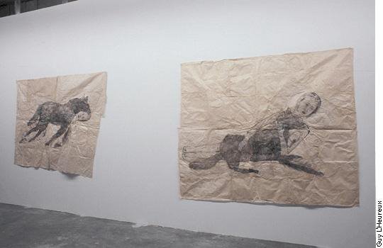
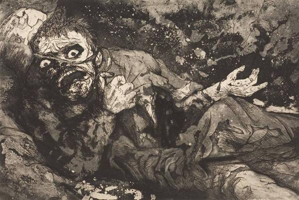
My First critique at grad school: I put up a bunch of prints
"why are you printmaking..it's obvious you should be doing video."
"You're at grad school, it's time to experiment with new and exciting materials"
"this would translate well into a film, perhaps you could use your prints as a background"
TRANSLATION: Your work sucks

So, I spent the last year or so trying to find a place in the art world that I liked. I still do not know what the big deal was with artists taking photos of the insides of microwaves, and creating grids out of them, or artists socially interacting with people chewing gum and then afterwards, displaying the chewed gum (aren't those teeth marks beautiful?). Still confused, I found this article that was published a year ago. Now it makes better sense. It makes more sense of why I am so confused because the art world is nuts. It's like watching a parasite eat it's host from the inside out. The art world needs to be saved from the crazies.

But, what is this????
Feburary 3, 2005 - The New York Times

Ms. Heiss, director of the P.S. 1 Contemporary ArtCenter in Queens, and Klaus Biesenbach, a curator at P.S. 1 and its big-sister affiliate, the Museum of Modern Art has this to say. "As the world has changed since the last "Greater New York," so have the things artists are thinking about, the curators said. And "there's a lot more elaborate fantasy," Ms.Heiss said. "More storytelling, more science fiction." The projection and video work that so dominated the art scene five years ago has ebbed, she said, while drawing is far more common."


Below is the article on What is contemporary art?


Asking what's wrong with contemporary art begs a more basic question: what is it anyway? Angela Bennie canvasses opinion.

At the Sydney Writers' Festival last month art critic Peter Timms asked: what is wrong with contemporary art? He then attempted an answer. Contemporary art, for the most part, was mere product, made for the arts market - or in response to bureaucratic dogma (the Australia Council's, in particular) or, worse still, to critical theory (French, mostly, but latter-day postmodern theoreticians generally).

Most culpably, it was solipsistic, pursued its own agenda with little regard for or engagement with an audience's need for profound reflection and thought, let alone aesthetic pleasure.

In fact, contemporary art is deliberately "abstruse", Timms said, so that audiences will find it "difficult", and therefore think it clever and profound, when really it is just banal and facile. It achieves its impact and notoriety, not through profundity, but through the hype created by the industry's hangers-on, the "money-changers, hucksters and spruikers".

If the same audience had attended the first round of panel discussions, lectures and symposia accompanying the opening weekend of the 2004 Sydney Biennale they would have thought they were in another city, time and historical epoch. It surely could not be only four weeks later?

For here, the question "what is wrong with contemporary art?" would simply not compute. In this 21st century, in this moment of "contemporaneity" [the new buzz word, we were told], the urgent question was instead: "What is contemporary art?"

Given the extraordinary range of works labelled as contemporary art, it is indeed a fair question. Installations, videos, bodily excretions, ephemera, badly made beds, elephant poo and pigs in aspic join framed oil paintings, etchings, drawings, photographs and sculpture in what Professor Terry Smith of Pittsburgh University called, in his opening address, "the dialogue that is contemporary art".

The 2004 Biennale is buzzing with this chatter. Airplanes made out of clothing, photographs of a woman's glistening cervix, floors spattered with circles of fake hair and boulders smashing cars, all are participants in Smith's dialogue by virtue of the fact that they are "simultaneous to each other and the time they are in".

Biennales, said Smith, were important because they were not so much exhibitions of art works, but a new form of art criticism itself. "They grapple with issues that most traditional art criticism avoids; and they show what art looks like globally in the immediate present. Contemporary art practice is dialogue," said Smith.

Dirk Snawaert, the artistic director of the Museum of Contemporary Art in Lyon, France, speaking in a panel discussion on the future of the museum of contemporary art, took it all a step further.

"Today, art is not the art work any more," he said. "Today art is art practice. It is art-in-process."

Hence a room full of cheeses covered in Band-Aids at the Museum of Contemporary Art, which will, as time goes by, crumble with great pungency into dust. Or the wanderings of Belgian artist Francis Alys and his band of pessimistic volunteers, doomed to travel the streets of Sydney, trying to find a home for one of Alys's sculptural figures. Both the Art Gallery of NSW and the MCA have refused to allow it into their collections: the refusal is integral to the process of Alys's art "work".

"Museums house the relics of the past," said Snawaert. "The future contemporary art museum will have no collections or relics. It will be a space that offers residencies to artists to produce art, rather than a space that houses artworks. The new museum will be a place of production, rather than presentation."

And what of these "producers" of contemporary art, the artists? Is "artist" still a legitimate word in this era of contemporaneity?

In a session which asked if artists could be "created" through education, Professor Su Baker of the Victorian College of the Arts said our art schools were geared to produce "graduates primed to produce works for the market and to create new markets".

Whether they were artists or not, however, only time - in some cases, a long period of time and dedicated work - would tell.

"We see our school as a kind of agency to help students achieve their goals," said Baker. "They do not come to study a particular discipline, but to participate in a culture."

That culture, she said, was not the old-fashioned, hierarchical structure of master/student. "The teacher/student relationship has shifted from hierarchical to a mutually engaging enterprise, where together teacher and student explore the cultural terrain with a spirit of curiosity.

"The model is an active one, not passive. Today the art school is a place that creates a milieu and context for exploration and creativity, not as a place that hands on a prescribed canon of knowledge."

Which brings us back to Peter Timms and his complaint. To ask what is wrong with contemporary art presumes a prior canon of knowledge about what is, and what is not art, and what is good art and what is not - contemporary, modern or any other kind.

In these days of "contemporaneity", it is clear, such a presumption crumbles, like the cheeses at the MCA, pungently and with irrelevancy onto the dust heap of history.

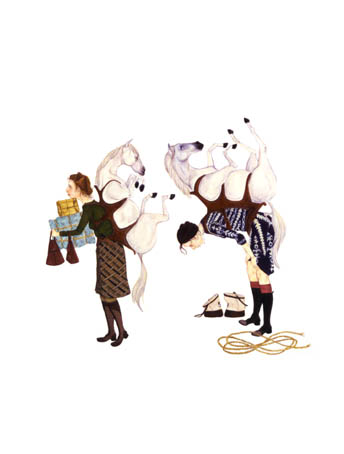
Yeah, baby...take that, and that.....ooooppss did I miss a spot....AND THAT!!!!

Wednesday, October 12, 2005

"In the hands of the artist printmaker, the intaglio plate,
the materials, and the techniques form a web of dynamic,
continuous patterns in which the artist is an active participant.
In this way, printmaking becomes a living art-a path of learning
and discovery through which to express oneself."


----Krishna Reddy

Otto Dix


Over a year ago, I was working on a farm in the mountains of Northern Italy, and the woman we were working for told me about a little art museum in the near by town in Revereto. It took us an hour to hike down the mountain and another hours drive to get to this town. We had been living for weeks without outside contact...hot water, heat, and electricity, so this was quite an adventure for us to be in society again. Of course I gourged myslef on 30cent chocolate bars from Lidl, 50cent wine cartons, 1Euro Brie, and 3Euro for the best gelato in the world. We headed for the art museum. I wasn't expecting much, and was happy to have gotten in under a student discount. (I look very young, so it was very easy to get discounts for under 18yrs of age in Europe....I even got into the Louvre for free!!!). The exhibition was on the Dolomites, so we spent room after room, hours, after hours....gazing at oil paintings of mountains. I thought I was going to die. I have very little appreciation for so many paintings of mountains. Finally we came across a print. It was a print made by Albrecht Durer, and aparently he had travelled on foot (possibly he had a horse) across the dolomites. It was his first time going to Italy for he was trying to get to Venice. Seeing his print made me so happy. I thought about him hiking through the mountains that I was staying in, and I thought how brave he was, and how scared he must have been. We were also both the same age at that time. As we continued, we saw more paintings of mountains, and I finally had enough, so we ran through the rest quickly. Suddenly, I saw very dark images on paper. I got closer and realized that I was seeing something amazing. I thought to myself "...no this cannot be Goya because it is too messy, but it looks so similar." I saw the artists name and it was Otto Dix. I thought to myself what an amazing discovery I have found in the middle of no mans land. I wrote his name down and had a huge grin on my face all day. After my trip was over I was able to do more research on him. Somehow in the back of my mind, I had already known about him, but only through his paintings. I find his etchings a whole lot more compelling.

Saturday, October 08, 2005

Kip Deeds

Here is an article I enjoyed reading from fallon and rosof artblog. I can relate to a lot of the comments Kip mentions below. It makes me feel good to read about artists like him. I feel like my own artistic sense is becoming more clear to me, and I'm starting to feel more confident in my beliefs.


Vision in word and Deeds

Libby and I met Kip Deeds a while back when Spartaco Gallery existed and Deeds' friend Jason Urban was having a solo show there. Deeds and I had a short but intense chat and he was someone you'd remember -- sensitive, a little shy maybe. He said he was working on some autobiographical art. We had a Midwest connection -- he got his MFA from the University of Illinois and he taught in the summers at Interlocken, the music and art camp in Michigan's Upper Peninsula.

Since then I had seen his work here and there -- in the "Comix" show in City Hall. And he'd sent me a book he'd made, "Key Note" which had a nice silkscreened cover and inside a complex story in words and pictures having to do with building an ark, finding a key, slides on a projector, horses and Icarus. The book's illustrations are xeroxes of what look like woodcut prints. The style of illustration is rough hewn and muscular. The book is poetic.
"When the world is flooded we will need no rudder" is one sentence tossed in the mix.

"Possession proves illusive as the untold unfolds..." is how the book ends.
In spite of all these clues I still didn't get it. I didn't see that what Deeds is doing is visionary art.
It took my seeing his installation at the Fleisher Challenge 1 where the work grows into one long yarn, a kind of grand woven opus, that it clicked. This is an artist whose storytelling in words and pictures ("picture writing" is graphic novelist Art Spiegelman's word for it and it applies to Deeds' work even though what he's making is not comix.) is akin to that of Elijah Peirce. It's not made by an outsider but it comes from the outsider's state of mind and integrative way of thinking and making.

I had coffee with the artist last week and I'll try to do justice to our talk which travelled between Bucks County (where he lives and grew up) and Quakerism to ideas about art, naive art and distilling personal experience into words and images. What I learned is that the same way that you can take a girl out of the Midwest and she'll still be a midwesterner 20 years later, you can take a visionary and school him with a BFA and an MFA and he'll still be a visionary and make art that expresses that impulse.

Deeds, who had to stop and think a moment when I asked him how old he was (he's 32 and just had a birthday), told me about making his first word and image piece. It was about the Houston Astrodome. He'd found a book about it that told the ground-breaking sports arena's history including details about how the baseball team for which it was created laater moved out wanting to be in a smaller old fashioned ball park. The book told about how the windows let in so much light they blinded the fielders and so they "fixed' that problem by covering the windows and then the grass died. Thus was born "astroturf." The book told that Elvis played there; Evil Knievel played his tricks there. The history captivated Deeds and so he did a piece with words and images all over it.
"A woman came to my studio and she said, 'You're not this naive.' he said." Meaning the work looked like it was made by a naive artist and here he was in an MFA program.
He fulminated about that and still worries about it. How can I make it more my own, he asked himself, answering that if he made part of the piece out of prints (he was a print major as an undergrad) he would surely overcome the charge of "faux naive."
So he made prints and collaged the printed elements on to the works.

Deeds wanted to know if I saw the Bob Dylan biography on PBS and I told him I'd missed it. He not only saw it but he read Dylan's autobiography. In fact he's a Woody Guthrie fan, too and listens to folk music alot. He says there's a correlation between folk art and folk music. "What school did Woody Guthrie go to? What school did Bob Dylan go to?" he asked rhetorically meaning the way those artists learned their craft was to look and listen at works in their folk tradition.
Hicks and Fallsville

Deeds' artists statement says he was influenced by the work of Alice Neel, William T. Wiley and Roger Brown. What it doesn't say is that he's also influenced mightily by Edward Hicks and the experience of growing up in Newtown, Bucks County, with its heavy history of Quakerism sitting on the land and little towns.
His parents rented an apartment to Edna and Richard Pullinger. Richard was an architect who designment many of the Temple campus buildings. Edna was a Hicks scholar and wrote a book about Hicks. The couple never had children and when Deeds would come around and visit them as a child Edna was always delighted. "She was quiet but she'd get excited at what I was doing. She was an influence."

Deeds is clearly moved by life experiences and by large and small moments. The Astrodome intrigued him as a story. So did the happenstance of seeing a sign for Arkadelphia when he was travelling through Alabama. That triggered thoughts about Philadelphia and arks and the floating world that is history.
His father's death from cancer has left a big footprint.

"I'm not very good with theory," he said. I went to a shcool where the head of the program was very theoretical. (Buzz Spector). I read Art in the Age of mechanical Reproduction...yah, but so what? What does that mean for me?"
"The Author as Producer" influenced me more. It's about being influenced. I thought about that in relation to gallery culture and New York. In a way you're no longer the author (when you're producing things for the gallery culture)."

It made me aware. It's a subversive text.
Right now Deeds is living in his mom's house doing work in exchange for rent. He's worried about whether he'll get a teaching job or not. He's worried about finding a gallery that fits with his work.
Finally, here's what he wrote me in a follow-up email: There was one thing I also forgot to mention about Edward Hicks. Besides the the Peaceable Kingdom series of paintings the only other painting that Hicks made that directly illustrates a passage in the bible is his painting of Noah's Ark which is at the Philadelphia Museum of Art in the American art section. I was aware of Hicks' ark painting before I began making my own ark. This was an inspiration for me along with seeing the sign for the town of Arkadelphia. Hicks' ark painting is a favorite of mine but unlike the Kingdom paintings it was never followed up in a series by Hicks.

I'll leave it here. For more on Deeds, see his website. To see some of these images larger see my flickr site. The Fleisher Challenge 1 is up through Oct. 8. Check it out if you haven't already. Also showing work at Fleisher are Sarah Gamble and B. Ever Nalens.

Thursday, October 06, 2005

Kurt Kemp


Kurt Kemp
Plate 5 from The Drunken Boat portfolio
Unique handcolored etching on Lana Grauvre paper
Paper Dimensions: 21.5" x 14.5"


The artist switches back and forth between drawing and printmaking and often mixes the two in his work. Kemp has been drawing since he was a child, but the demanding craft of printmaking caught his eye early in his college career.


Article
Monoprints
More Work

Dasha Shishkin


Etching (click image to enlarge)


Ink on Napkin


Etching


The artist is Dasha Shiskin, and I just love her work. It makes me excited to create prints when I find a contemporary woman artist that I like!!! Dasha Shishkin's Bosch-like etchings mix recollections with Russian mythology. Imposing limitations for each print, she creates swooping, elegant illustrations that when examined closely, suggest sinister moments.

Shishkin was born in 1977 in Moscow. Her compositions, often a nod to the chaotic worlds of Hieronymous Bosch, are rendered in a precise and handsome linear quality. The vocabulary of recurring figures and forms allows Shishkin to discuss what she calls "a larger theme of violence on paper where the works serve as literal illustrations to the abstract struggle of forces within an individual".

Each plate in the group of eight etchings titled The 400 Series was made in under four hours.These etchings are an example of the artist confronting violence and aggression by allowing them to manifest on a copper plate and then ultimately on paper. A simian-like animal wearing a feathered hood hands a ball to a woman in Victorian dress while a bald, moustached man in spectacles holds her in space while looking malevolently at the viewer. The man sits on the shoulders of another who is held by another who seems to be transfiguring, shrinking and flying away. Below, a daisy chain of horses perform. A trapeze artist plummets while a lone hand waits impotently near the top of the sheet. A headless woman falls out of the grasp of the transfigured man, and so go the actions and reactions in these riotous and psychologically charged prints.

Shishkin suggests that "the pictures exist as processes, without narratives or main characters. Like a city street flowing with crowds lacks narrative until someone, an audience member, breaks the mundane into events and gives it meaning".

Her drawings and smaller etchings are more poignant. Quick and surreal, they ambulate between daydreams and nightmares. The line is reminiscent of a very young Lucian Freud and the images of figures bursting out of each other, transmutating and assuming animal-like characteristics convey a twisted cruelty that hides out in our subconscious.

Dasha Shishkin will receive her MFA from Columbia University in 2006. She lives and works in New York City.

Sunday, October 02, 2005

Squeak Carnwath


Squeak Carnwath
Backwards Map (2002)
Color aquatint, spitbite,
sugarlift and soapground
etching with softground,
hardground, drypoint,
sanding and chine collé

Somerset white textured paper
Image size 30" x 20"
Paper size 40" x 29"
Edition of 30

Emerging in the early 1980s, painter Squeak Carnwath, a Professor in Residence at the University of California at Berkeley, has evolved a number of vocabularies with which she explores the dilemmas of the self in relation to a larger world. Carnwath combines luminous color with handwritten notations, hieroglyphic symbols and the delineation of everyday objects. Meaning is not read literally or narratively from her canvases, but is instead elliptical and open-ended.

Carnwath's canvases and prints evoke the loss, doubt and humility that are rooted in life's experience. Her compositions register, often whimsically but also viscerally, emotional pain, the questioning of truth, and the recovery of difficult family memory through therapy. The artist is committed to revealing something of herself in her work. Carnwath humorously tempers her expression of free-floating anxiety through the use of occasional tongue-in-cheek references to Freud, and the establishment of dotted, outlined areas, so-called safe spaces that she terms "Guilt Free Zones" (a reference to the residual guilt of her Catholic upbringing). The artist manages to effectively turn personal disquietude toward a larger expression of concern for what she calls the crisis of contemporary existence. Over the past few decades, Carnwath has attempted to conduct an extended conversation in her work about (pre-September 11th) social ills such as the environment, violence, crime, AIDS, and urban despair, as well as those that can be less easily identified. Indeed, this artist - a kind of poet-scribe putting down on her canvases the questioning inner conversations that we all experience - has become a voice for our day-to-day imaginings and conscience. Graphically, sensually, Carnwath weaves together a dizzying register of the daily minutiae that fill our heads, with subtle references to the larger social, political and economic issues that we confront.

Interview with Squeak Carnwath

More writings about her work

Tuesday, September 20, 2005

Yizhak Elyashiv


For Immediate Release
Contact: Karen Mulcahy

Yizhak Elyashiv: Prints & Drawings from Ireland, 2000 – 2005
Beth Galston: Ice Forest
September 15 – October 15, 2005

Yizhak Elyashiv opens a show of large scale work on paper at Reeves Contemporary on Thursday evening, September 15th with an artists’ reception between 6-8 p.m.

Elyashiv, now working and teaching in Providence, Rhode Island, is an Israeli artist who has done collaborative projects with numerous well-known printmaking studios, in an effort to realize his ambitious, large-scale works. Some of the works measure six by ten feet, at times incorporating sixty plates, with an intricate webbing of map-like marks connecting the discrete plates. Over painted marks interject color and graphic impact on the etched monoprints. The new series of ‘maps’ incorporates Hebrew prayers – these become the rhythmic patterning that punctuate and elevate the prints to an elegant and compelling statement of quiet force.

Tuesday, September 13, 2005

Horst Janssen


Horst Janssen (1929-1995) was introduced to me by Joel. His art lies deeply within my heart. I spent the most part of Fall 2003 reading his writings, and was captivated by them. I will be writing more about him throughtout the year, as I plan to go back and read his writings again. His book are so rare to find, and a lot of them tend to be in German. I can't help but look at some of his work and notice how a lot of artists today are working similarily to the way he worked.

Prints
Art Work

Friday, September 09, 2005

Pressure Printing


I like a lot of the artists working at pressure printing. I guess you could call the majority of them pop surrealists. Using unique handpresses Brad works with artists he admires to create unique and sought-after print editions of the finest quality.

I just love the presentation of the prints. They are so skillfully done, and packaged beautifully. I haven't started a print collection yet, but when I do decide to start, I want to pick up one of these packages. They seem to be very cheap too!!!

Monday, September 05, 2005

The Artists' Press, Newton Johannesburg


Dumisani, Mabaso
"Afternoon"
six color lithograph

I really want to visit this print shop some day. I used to work with people from South Africa. I loved hearing about the history of South Africa, and its current situation.

In 1991 The Artists' Press opened its doors in Newtown, Johannesburg, under the direction of Tamarind Master Printer, Mark Attwood. The Artists' Press started as a lithography studio providing artists in southern Africa with a workshop dedicated to the production of limited edition hand printed lithographs. The Artists' Press has been internationally recognised for its contribution to developing the culture of printmaking in Africa. The studio has initiated and taken part in a number of exciting international and regional projects.
Our Vision:

*To provide artists with the opportunity to collaborate with a master printer to produce original prints of the highest quality.

*To introduce visual artists to lithography as a new medium.

*To work with artists from marginalised communities to offer them new
opportunities and to promote their work through the collaborative process.

*To contribute to the development and expansion of art in southern Africa by focussing on excellence.

*To contribute to ongoing research and the development of printmaking techniques together with printmakers from around the world.

*To introduce global audiences to South African printmaking.


Monday, August 29, 2005

Printmaking Methods Old and New: Gabor Peterdi


Check out my new Book!!! I checked this book out so many times to use as a reference that nobody could have possibly read it in the last year. Now I finally own it, and my one is in much better condition than the one at my school.
Happy, happy, happy!!!

Friday, August 26, 2005

Amy Cutler


I first saw Amy Cutlers work when I went to the Walker Art Museum a few years ago. I remember stopping and staring at her work for a long time. After seeing large scale paintings, crushed painted cars, and video intallations, her work was a breath of fresh air to me. It was so simple, yet it impacted me more than any fancy computer work that I had seen in the museum. The work was quiet and witty. I was happy to find out that Amy Cutler was coming to our school. It was the first time when I realized that there was a contemporary young female artist out there that I could feel connected to. Her lecture was so down to earth and insightful. I felt like she could have been a friend that I grew up with. Below is a descripion of the concepts behind her work.

Telling Tales
by Ana Finel Honigman

Before children become old and blasé enough to work at making sense of life’s ethically grey areas, fairy-tales offer a world filled with moral paradoxes, beautiful colors and high-key imagery. In fairy-tales, childhood’s fears, aspirations and desires are transformed into lush metaphors and images children can digest. But once children grow into adults, fairy-tale logic, the kind where combs become forests and wolves can speak, looses its immediacy and meaning.

Brooklyn-based Amy Cutler paints grown-up myths. She uses insight and skill to present original parables of women who are tethered to Cosmo Girl-induced insecurities, desperate for transformation and haunted by traditional definitions of femininity.

Interview with Amy Culter


Ana Finel Honigman: Do you have a full narrative in mind when you first conceive of your paintings' iconography?

Amy Cutler: No not really and there are always elements in them that I don’t fully understand fully myself. I'll pick up on odd references and inject them into the narrative without necessarily interpreting them first.

AFH: From where do you cull your references?

AC: Often things I read about in the news inspire me.

AFH: Your paintings are not very journalistic. Do you think the term magic realism could apply?

AC:That sounds about right. While I absorb references through the media there are always underlying personal meanings in my paintings. Often it will be a year or more before I feel like I fully understand why I selected certain images and painted them the way I did.

AFH: Are you ever unnerved by how your work illustrates your personal life?

AC: Well, the painting in the Whitney of the women with the fans under their skirts actually had some surprising symbolism for me. I was thinking that putting electrical appliances in my images was a departure from what I usually do but I didn’t feel it was really that remarkably different since I was not entirely abandoning the element of nostalgia. So, the women are still in the forest doing their laundry but all of a sudden they have an electrical fan to help them.

AFH: But where do they plug in the cords?

AC: That’s the surprise! At the time I could not understand why I had chosen this imagery but now I see that it relates to this particular time in my life when I am undergoing some intense personal transitions. So, the fans refer to a need to liberate oneself with, and I know this sounds corny, internal resources. As a woman, the lower half is conceptually so weighty that the fans offer the women the possibility of elevating themselves above that gravitas. It is really cheesy but because they have electrical fans and no source of external energy, I am realize that the source of their power is within themselves.

AFH: It does sound a little Oprah-like when you say it. Painting it is definitely much better.

AC: And it is important for it to be open-ended.

AFH: Are you skeptical of critical interpretation of your imagery?

AC: I usually find it very interesting. Sometimes I learn from critics’ interpretation.

AFH: Do you consider yourself as just one reader of your imagery and not the final authority?

AC: If a particular reading of my imagery is repeated by a lot of people than I often start to wonder whether I wasn't being as articulate as I had hoped or whether, perhaps, there were things in the image I just could not see for myself.

AFH: Do you think there a possible “correct” reading?

AC: Because my work is so illustrative, if something is misinterpreted too often then I just worry about the clarity. A couple of men reviewing the show kept talking about the painting Progeny as "women giving birth through their months." That was absolutely not my intention. I was looking at the image from a women’s perspective and thinking about friends of mine who are starting to have children and are losing their own identity because they are subsuming themselves entirely into the maternal role and the needs of the child. They start to wear cute little garments and direct all their attention towards their amazing little miracle. All they talk about are baby-related topics and a lot of women my age are deciding to give up their careers and lives as individuals.

AFH: Have you noticed that men tend to have different interpretations of your imagery than women?

AC: Yes, men and women typically do see my work very differently though there is always that sensitive guy who can really get it.

AFH: Do critics’ interpretations interest you more than those of an average viewer?

AC: It all interests me. I get a lot of one-on-one criticism including from people who want to tell me their personal stories. And because I put a lot of my own life into my images, though the particulars are coded, I think there is enough of a sense of intimacy in my work that people are inspired to share their stories with me but oddly, critics’ tend to be a little shy in their interpretation. I think people are timid about revealing their personal interpretation of my work on record because it can be as ultimately revealing of the critic as of my work or me.

AFH: Are there particular themes you return to often, such as exploitation, as in Sugar Foot, your painting of women eating the sugar drained from other women’s flattened bodies....

AC: Oh, I don’t see that painting like that at all. That is great! Actually, that painting is related to another painting I’d done titled Ironing. In that image, two women are ironing other women until they are completely flat and then they roll each other up and push each other to the side. That image was partially inspired by reality nip-and-tuck shows like The Swan but on a deeper level, it also relates to women’s criticism of each other and their obsession with a super thin one-dimensional self-image.

AFH: And what about the iconography in Sugar Foot?

AC: Sugar Foot was related to our contemporary fascination with our diet and micro-managing what we eat. I recently read a book titled Our Own Devices: The Past and Future of Body Technology by Edward Tenner in which there was a passage where he describes how sugar was considered a health food throughout much of this century. Sugar was thought of as a great source of nutrients and sustence. Apparently, this belief was so firmly held by doctors that in Mozart’s day, they would substitute mother’s milk with sugar water.

AFH: That sounds repulsive.

AC: Well, when I was a kid, I ate sugary cereal every morning and thought it was healthy. But in Sugar Foot the women are all pale, malnourished and miserable despite, or because, of the fact that they are gorging on cakes and mountains of sugar.

AFH: It is odd to think that Woody Allen prophesized the Atkins diet in Bananas, his satire of weird LA- food fads, with massive, genetically processed vegetables and other food-monstrosities.

AC: Contemporary culture is entirely rife with magic and folklore. When I read the New York Times, I tend to latch on to random stories and the imagery. Recent scientific experiments, like the one where they grew a human ear off of a pig’s back or genetically crafted hybrid mice really inspire me. I am full of those stories. I could be the town freak with all her creepy tales but instead I paint.


ANA FINEL HONIGMAN is assistant editor at Artnet Magazine.

Friday, August 19, 2005

Louise Bourgeois


Louise Bourgeois is another artist/printmaker that I admire. Her work has often been recommended to me along with Kiki Smith and Nancy Spero.

db artmage
The artist Jenny Holzer said: "When I review the testimony about what is wrong with women, Louise Bourgeois’ work is the perfect rebuttal." At nearly 93, Bourgeois, who hasn’t left her house in ten years, is hard at work making sculptures and installations from stitched fabric, wood, steel, latex and marble as well as drawings and prints. She still holds her famous "Sunday Salons" where artists are invited to bring work at their own risk. Bourgeois often includes text in her visual work and has kept a copious diary from a very young age. Bourgeois’ sculptures and installations use hooks, guillotines and sculptural incisions as flaying devices related to a disruptive past. Bourgeois uses events she saw as a young girl during and after WWI when large numbers of men returned from battle as amputees. Body parts are frequently the subject of her work. As the feminist artist Adrian Piper has said: Louise Bourgeois’ "work draws us into a space where the dynamics of power and surrender, of gender identity, the circumspection of the body, and relation to the mother are unavoidable. It forces us to become aware of our own status as incomplete adults." Bourgeois’ relationship to feminism is best epitomized by events of the late 70s.


Here is an interview between Cheryl Kaplan and Louise Bourgeois

Cheryl Kaplan: The Reticent Child features a suite of 18 drawings titled Almost A Nobody. The title recalls Emily Dickinson’s poem: "I’m nobody, who are you?" You’ve said: "Life is organized around what is hollow."

Louise Bourgeois: Almost A Nobody refers to stairs and the idea of climbing to success. I'm interested in people's ambition, their enormous desire to exist in the world, to be somebody, and to succeed — sometimes at any cost.

CK: I first saw your Cells in the Venice Biennale in 1993 and then in Oxford at the Museum of Modern Art. They made me think of Ezra Pound detained in an open cage for 25 days having been accused of treason at the end of WWII. In your work, a highly internal moment is exposed publicly and then kept private. How did your Cells transform from the earlier ones in the 80s to the later ones, especially in relation to issues of public and private observation?

LB: My use of the word 'cell' has to do with the fact that I am a prisoner of my memories. The original suite of the Cells had to do with the five senses and memory and had nothing to do with the issues of humiliation and internment. The sense of containment in the Cells has also to do with the idea of isolating problems in order to solve them. I also like to know my limits and that's why I prefer claustrophobic spaces. The Cells also express the notion that people are isolated from one another and unable to communicate. This is the human condition.

I needed to create architecture to house and protect and set the scale for these objects. The objects in the Cells are fragile. The fact that you cannot enter them in most cases had to do with the fragility of the interior. This is a problem when they are shown publicly. I would like people to enter the Cells.


LB: The guillotine, like all my images, is not realistic. It is a metaphor for how the present kills the past. In the Cell Choisy, I recreated the house where I had lived because it no longer existed. There is no real victim in this work because we have to accept the fact that the present destroys the past and there is nothing we can do.

CK: Femmes Maison, is both a series of drawings and sculptures that literally refer to a "wife-house". In Cells, the architecture is transparent, while Femmes Maison is about hiding.

LB: As a sculptor, I am interested in space – whether it is real or imagined. Sometimes I want to hide, and sometimes I want to go out and seduce.

CK: What are your feelings now about feminism? In 1988 you told art critic Donald Kuspit that "Feminism is important to me." Later, you had mixed feelings, associating feminism with victimization. In speaking with Robert Storr you said: "There is no feminist aesthetic (…) The women got together not because they had things in common, but because they lacked things." But you’ve also written: "My feminism expresses itself in an intense interest in what women do."

LB: I don't believe there is a feminist aesthetic. A lot of the emotions that I am expressing in my work are pre-gender. I am lucky to have been brought up by my mother who was a feminist, and fortunate enough to have married a husband who was a feminist, and I have raised sons who are feminists.

CK: Lucas Cranach, a favorite artist of yours, painted Lucretia as she’s about to commit suicide, having been raped. Like most of Cranach’s females, Lucretia is strangely demure, yet extremely violent. I’m reminded of the piece you did in Artforum in December 1982 called Child Abuse that focuses on your father’s relationship with Sadie.

LB: The piece entitled Child Abuse in Artforum was done to coincide with the opening of my first large exhibition in New York. This work was my attempt to explain the person behind these objects.

CK: The Destruction of the Father, done in 1974 is an incredibly visceral piece, cast from lamb and chicken bones. The sculpture is overrun with tumorous protrusions. It’s scary, yet strangely natural. Destruction is about getting rid of someone but also keeping them around. The sculpture’s support resembles a field hospital stretcher. In what way were your childhood visits to see your wounded father in army hospitals during WWI part of this piece?

LB: I accompanied my mother during the War when she went from camp to camp to stay close to my father. I felt my mother's hysteria. The images of the soldiers on the trains and in the hospital have stayed in my mind. The fear of abandonment is very strong within me and relates to that time.

CK: As a registered Democrat, what do you think of the recent re-election of George Bush especially concerning women’s rights? I’m thinking of his potential to appoint ultra-conservative judges on the Supreme Court.

LB: Bush's re-election is unfortunate not only for America but for the entire world. Life is being reduced to economics. Values and the quality of life are at risk. As the disparity between the rich and poor grows, religious fanaticism grows. I believe in the separation of church and state. I'm particularly concerned with the environment; mankind is destroying the planet and seems to be oblivious.

CK: Can you talk about your series of nine engravings He Disappeared into Complete Silence done in 1947?

LB: He Disappeared Into Complete Silence was completed in 1947, and uses architecture as a metaphor for human relationships. These structures are related to the Personages that I was carving at the same time.

CK: The suspended figures, from the Spiral Woman , 1984 through Janus Fleuri, 1968 and Filette (Sweeter Version) , 1968-99 as well as the Arched Figure, 2004 in your current exhibition at Cheim & Read dangle between a moment of danger and beauty. The Arched Figure hangs on by a thread, bobbing up and down. In referring to your suspended figures, you said: "[So] this little figure is supposed to hang (…) She turns around and she doesn’t know her left from her right. Who do you think it represents? It represents Louise. (…) It just means that she is herself, hanging, waiting for nobody knows what." How do you feel about the dangling now?

LB: To hang from a single point is to exist in a state of fragility. It is still how I feel today.

Thursday, August 18, 2005

Sketches


I like to do these little pen sketches. Using a pen instead of a pecil allows me to be more creative with my line and more confident in my mistakes.

Wednesday, August 17, 2005

The Garden of Earthly Delights

The Garden of Earthly Delights
Irish Arts Review (Dublin, Ireland)

By GERRY WALKER
When Hieronymous Bosch created his vision of The Garden of Earthly Delights c.1500, he sought to depict a world in resolute pursuit of sinful pleasures. The triptych charts the history of creation and the pervasiveness of sin. It is a cautionary tale in a surreal setting, calculated to induce an awareness of the drastic consequences of worldly indulgence and the urgent necessity for repentance -- a grand narrative whose tone is zealous and didactic both in intent and effect. Happily the current exhibition by Graphic Studio artists, also called The Garden of Earthly Delights, at the Chester Beatty Library, is a lot more life-affirmative and a lot less life-prescriptive.
Historically we are familiar with the idea of the garden as a metaphor. The physical will-to-form not only reflects our ability to subdue, shape and cultivate the natural world, it also demonstrates and enables the desire to contemplate a spiritual inner space. Hence Japanese and Chinese gardens are noted for restraint, Islamic gardens espouse symmetry and Christians attempted to celebrate romantically the Creation itself. In all instances, aside from physicality, the true spaces created were interior, contemplative and philosophical.
This is the context in which the Graphic Studio formulated a brief for its members and invited guests to each produce a limited edition print using traditional printmaking techniques in response to garden spaces and related imagery as they are represented throughout the collection of the Chester Beatty Library. Each participating artist was encouraged to use the collection as a resource and point of inspiration in the creation of their own Garden of Earthly Delights.
Initiated by the Graphic Studio, the show is a collaborative project with the Chester Beatty library. It follows on from another successful venture with the library the Holy Show in 2002 in which artists were invited to give a visual response to biblical texts using sources and references from part of the considerable print collection held in the library. A similar successful joint venture with the National Gallery entitled Art/Art in 1998 was based on responses to the gallery collection. In all cases there was a desire on the part of the Graphic Studio not only to initiate a dialogue between the old and the new and to unite a disparate group of artists behind a common theme, but also there was a recognition of the need to foster collaboration with other significant cultural institutions. The effects are, one feels, inevitably mutually beneficial. The dialogue between old and new, results in renewed interrogation of the value of national collections. It reinvigorates and reinforms the imperatives of curatorship itself and it creates a wholly new stream of work with the process of each engagement.
These collaborations are indicative of an inherent dynamism within both participating institutions. The Chester Beatty library has a substantial European print collection numbering . over 35,000 items. This is the largest collection of Old Master prints in Ireland. Chronologically the collection extends from the 15th century with early woodcuts to the 1960s and it includes some works from the Graphic Studio which Beatty purchased when he lived in Ireland. The library also has a policy of constantly evaluating and re-presenting its collection along with promoting greater accessibility in an innovative manner. This was evidenced recently in Irish writer Colm Toibin's curatorship of selected blue artefacts from the collection.
Within this sympathetic ambience thirty-nine artists, have attempted to pursue a common theme of the garden as earthly paradise, refuge or place of spiritual solace. These include Brian Bourke, Hughie O'Donoghue, Mick Cullen, William Crozier (Fig 6) and Gwen O'Dowd (Fig 3), all of whom enjoy the status of visiting artists in the studio. Inevitably some have chosen to interpret the original brief very liberally, others prefer a more literal approach and more work through the constraints of illustration, opting for somewhat literary and anecdotal interpretations. A good deal of the work created reflects highly individualised stylistic concerns.
Brian Bourke's etching entitled Leopold Bloom's Earthly Delights is uncharacteristically nostalgic (Fig 7). Rendered in his essential pared-down drawing style it refers to a music hall song going through Bloom's mind. The image is based on an old photograph taken in 1915 of Bourke's mother and her sisters disporting themselves on the beach at Bray. Hughie O'Donoghue's carborundum print reveals a characteristic dark brooding landscape portentous and hinting of menace. Entitled Where is your Garden? it is more evocative of an interior space, and suggests a place of sombre introspection unencumbered by extraneous colour (Fig 9). In contrast Mick Cullen's customary exuberance shines through in his submission which he calls Bongo jungle. Colourful, gestural and bordering on the chaotic the image advances and recedes, conceals and reveals at the same time (Fig 5). Dimensions are vague and movement is constant in this garden. Space is undefined. Sensuality is all.
Among the studio artists themselves one senses a more specific engagement with the terms of the overall brief. The originators of the project, Jean Bardon, Grainne Cuffe and Cliona Doyle have each demonstrated their predelictions without ambiguity. Preferring to approach the subject directly, their strengths are underpinned by masterful technique.
Jean Bardon's etching reflects her interest in the Asiatic handscrolls bordered with silk brocade which form part of the Beatty collection (Fig 10). Entitled Flora Japonica the work depicts flowers which have symbolic significance or associations with different times of the year. Plum blossom is associated with winter in Asia and Chrysanthemum refers to longevity. It is a subtle exercise in control and delicacy.
Grainne Cuffe has opted to select types of flowers which best suit her formal pictorial requirements. Her etching, which depicts Bells of Ireland, Seeds and Lillies, expresses her fascination with purely formal complexities (Fig 4). The seeds are convex tetrahedrons. The Bells which stretch across the picture plane evoke a DNA helix -- another reference to structure and the lillies exist in a space that allows for quiet appreciation of their moment of perfection.
Cliona Doyle displays comparable formal concerns in her depiction of a Black Headed Conure. She has produced an arresting image of a parrot sitting on an apple bough (Fig 1). Her composition is bold and assured, using negative space to good effect. She achieves a depth of colour and texture which is remarkable for an etching. It is one of the most tactile prints in the show.
Chinese scroll paintings provided the stimulus for Janet Pierce's aquatint. Gerwhali Raga is an evocation of a landscape remembered from a trip to the foothills of the Himalayas (Fig 8). It is a tranquil compelling study in blue melodic recollection -romantic in the true sense of the term.
Ruth O'Donnell found her inspiration in the pages of a late medieval French book of hours. The title of the etching, Vignette suggests a pun on the practice of enclosing small manuscript imagery in a clecorative border of vines. The depiction is of a couple sharing a meal (Fig 2). The alfresco connotations are of garden tables, summer and childhood happiness.
These images best exemplify the unity within diversity which characterises the overall studio engagement with the library artefacts. They are strongly traditional in their execution and taken together they constitute a unique and substantial body of work. It is also most encouraging to note that there is no such thing as a house style within the Graphic Studio. Individuality prevails and one is left with the sense that a healthy internal dynamic exists which is further sustained and developed by external encounters.
This is plainly evidenced in the work of James McCreary. His distinctive mezzotint entitled A Visit by a Japanese Emperor is a gentle essay on whimsy. He obviously subscribes to the view that butterflies are harbingers of pleasure, joy and hope -- a welcome visitor to any garden. McCreary's confidence and formal acuity, particularly in spatial arrangement are grounded in his early experience of working at the Harry Clarke studio in the 1960s and his long time interest in Japan. Both of these great institutions have been enriched by this endeavour.
The Chester Beatty library showcases the artistic treasures of the major civilisations and religions of the world. The global collection of manuscripts, prints, miniatures, icons and early printed books is a rich national resource. By encouraging interactions such as the Gardens of Earthly Delights, thereby allowing for constant reappraisal of the concepts of museums, collections and curatorship itself, artefacts are redefined yet again, revivication is achieved and contemporary relevance is sustained. For the Graphic Studio the benefits are equally significant. Encounters with historical works reinform traditional values and techniques -- something the studio espouses. This leads to a widening of perspectives, a positive fusion of the past and the present and an increase in incremental learning for all involved. Since its establishment in 1961 the studio has provided facilities annually for etching, woodblock, lithography and carborudum printing for its members and sundry visiting artists. It is the oldest and largest fine art print studio in Ireland. Based in Dublin's docklands, it is a charitable, educational organisation and in other cultural jurisdictions it would be regarded as a national treasure. Now it faces uncertainty about its future given the pressures for redevelopment in the docklands area. Relocation may be an inevitability. Not unnaturally this causes concerns and deflects energy away from the proper concerns of the studio -- the maintenance of standards of excellence for which it has become famous. Prints from the exhibition are on sale from the Chester Beatty Library bookshop as are handmade box portfolios containing a single print from each of the thirty-nine artists.
ADDED MATERIAL
GERRY WALKER is Course Co-ordinator for Complementary Studies at the National College of Art and Design in Dublin.
1 CUONA DOYLE Black Headed Conjure 2005 etching 65 × 50cm
2 RUTH O'DONNELL Vignette Arum etching 50 × 20cm
3 GWEN O'DOWO Dracunculus carborundum 65 × 50cm
4 GRAINNE CUFFE Bells of Ireland, Seeds and Lillies 2005 etching 50 × 65cm
5 MICK CULLEN Bongo Jungle 2005 carborundum 65 × 50cm
6 WILLIAM CROZIER The Pool 2005 carborundum 37 × 44cm
7 BRIAN BOURKE Leopold Bloom's Earthly Delights 2005 etching 50 × 65cm
8 JANET PIERCE Gerwhali Raga 2005 aqua tint 31 × 25cm
9 HUGHIE O'DONOGHUE Where is your Garden 2005 carborundum 65 × 50cm
10 JEAN BARDON Flora Japonica 2005 etching and aquatint 20 × 47cm
The Garden of Earthly Delights at the Chester Beatty Library, 27 May - 2 October.

Friday, August 12, 2005

Prisons to Printmaking

Sorry, I've been M.I.A for a while. So much is going on in my life right now. I'm trying to get a few hours of volunteer work at the nearest printshop that I like. Also, I'm trying ot find other volunteer work with an art therapist, and a local art community program for kids. Also, I've been out and about enjoying the sun.

One subject that often interests me are stories of how recent printmaking shops come about. I find it fascinating what people end up renovating into printshops. Printshops often preserve history of some interesting buildings.

The evolution of Norwalk's Center for Contemporary Printmaking
by Brita Brundage - April 8, 2004


The stone building in Mathews Park in Norwalk that houses the non-profit Center for Contemporary Printmaking must have stories coursing through its walls, from the former stable areas where artists roll pages through printing presses to the upstairs hay lofts where a class undertakes lessons in monotypes. Where a gallery exhibits a celebration of the "solarplate revolution," female prisoners from the 1930s to 1950s once huddled against the wall awaiting bail. Former prison or no, the 19th-century building which sheltered horses for the Lockwoods Mathews Mansion Museum has all the traditional charm of large windows, low ceilings and wooden floors.

The police station across the driveway is another story. That squat, brick, charmless structure, which will be replaced by a new state-of-the-art police headquarters in South Norwalk in March of 2005, is awaiting some sort of judgment regarding its fate. The adopted plan for Mathews Park called for the demolition of the police station when the officers relocate. In February, Norwalk Mayor Alex Knopp announced that he was considering turning the former station into an arts center for performance and exhibition instead.

"In my view, Norwalk needs an arts center," says Knopp, "and it's always seemed to me the Mathews Park would be ideal. ... Instead of spending $400,000 to demolish the police station and then $350,000 to construct a landscaped parking area, let's use that [money] to be part of the financing of renovating the old police station into a Norwalk arts center." Structurally, the 1950s era police station may not be easy to convert. As Anthony Kirk, a Scottish master printer and CCP's artistic director says, "There's a lot of concrete and cells, and the basement was the firing range for the police department. There's [possibly] a lot of lead contamination in there."


Though the Norwalk planning commission removed money for a feasibility study, Mayor Knopp says he is having an engineering audit done on the existing building, using in-house staff and Grubb & Ellis, who manage many of the city's buildings.

Right now, says the mayor, "it's still in the conceptual stage. ... This really doesn't become an issue that's ripe for decision until quite some time away."

Kirk is ready to welcome any additional arts development to the patch of pavement he shares with Lockwoods, Stepping Stones Children's Museum and the YMCA across the street. "It's not competition," he said. "The development planned between Wall Street and the Maritime Center for business and residential will offer more to do locally for families who want to walk around."

With its historical presence, CCP already has something no new building can capture. And Kirk and crew could not have put it to more appropriate use. The old printing presses, the etched plates and inks are ancient art tools. "If Rembrandt were here, he'd know what I'm doing," Kirk said, peering over his glasses at a mezzotint, his hands stained with black ink. While the center does include a digital production room upstairs for manipulating images in photoshop, as local inner city kids are being taught to do through a program called Arts Task Force, it's the classic papermaking and printmaking techniques that are the center's pride.

"People say there is a lessened interest in traditional printmaking," said Kirk, "But I can't believe all that knowledge will disappear. Can you imagine in 50 years people saying, 'What is a dark room'?"

While CCP has had no trouble attracting wealthier Fairfield County women to its classes and lectures, it's had to work a bit more concertedly to find diversity. Last year they scored a few points shy of the total necessary to garner a grant from the Connecticut Commission on the Arts because of a lack of racial diversity. Kirk has since made it his mission to expand the CCP's racial reach. The next exhibit, works from students representing 21 area high schools, will showcase the fruits of CCP's labor. From George Washington Carver Center in Norwalk to Darien High School, the resulting self-portraits from two courses taught by artist Benny Andrews should tell an interesting story about CCP's ongoing evolution. Upstairs, where Ronnie Maher of Briggs High School teaches photography to after-school students, kids are given digital cameras to snap shots of their home environments, often brick-bound projects bordered by fencing. One picture shows the back of a police officer, another shows kids in a desolate playground. All photos are black and white and give an honest portrayal of the forlorn places these students return to every afternoon.

A few steps from CCP's back door, another story is unfolding in a cottage that was renovated and opened last year at the cost of $250,000. The project was funded half by the city and state and half by private donations. There, in a cozy two-bedroom-one-bath house with two large printing presses and a small kitchen, artists receive a stipend to take up residence and complete a series of work in private. The first artist the center welcomed to stay was Scotland-based artist Paul Furneaux, an award-winning 40-year-old painter and printer who lost nearly all of 15 years' worth of work as well as his tools and supplies in the raging "Old Town blaze" in Edinburgh in 2002. Having lost his woodblocks, his prints and nearly all of his possessions, the trip to Norwalk afforded Furneaux and his family a chance to rebuild.

Currently, prints depicting Manhattan on the back of a whale in bright red and blue line the cottage's walls. They are the work of famed Czechoslovakian children's book author, illustrator and filmmaker Peter Sis, who collaborated with Bob Dylan on the film You've Got to Serve Somebody in 1983 and won a McArthur Fellowship for his pictorial children's books. Now living in Tarrytown, N.Y., Sis is using the solitude of the cottage to make etchings and reproduce prints of a poster he made for the Metropolitan Transit Authority.

"This place frees an artist from the cares of the world for a while," said Kirk.

Fifteen years ago, the cottage was derelict, full of debris. One can only hope the old police station willget razed or refurbished long before the same neglect sets in.