Tuesday, June 12, 2007

Matisse as a sculptor and Printmaker

Last Wednesday, I went with a friend to the opening of Matisse as a sculptor at the SFMOMA. Note to self: never go to an opening at SFMOMA. There were so many people. I am surprised that none of the sculptures fell off the podium. I thought the exhibition was nice. I liked how the sculptures were displayed along with some of his paintings, drawings, and paper cut outs. It really brought life and dimensionality to his artistic practice. I did not however some across any of his prints. So I did a little research and found this:


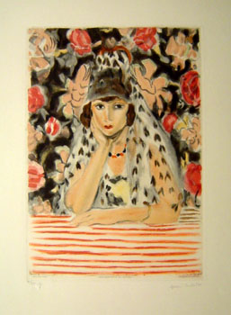
Matisse's interest in printmaking was concentrated into relatively short periods throughout his career, but his output was prolific, both in etching and lithography. His first significant group of etchings, of 1914, are intimate portraits of friends and family executed with astonishing speed.

In the early 1920s he turned with enthusiasm to lithography, and from 1925-30 he produced more than 80 studies of models, nude or draped, surrounded by flowers, fabrics and furniture whose fluid lines merge into an arabesque of pattern. His contact with Diaghilev in 1927 inspired numerous prints of ballet dancers and the portfolio 'Dix Danseuses'.

In 1929 Matisse resumed etching, working directly on the plate from the model and producing a constellation of nudes and odalisques whose lively clarity of line replaces the still, voluptuous atmosphere of the seraglio. His printmaking allowed to him to explore and distill in other media the themes that preoccupied him as a painter.
-Merivale Editions


I realize that it wasn't a retrospective of his life's work, but still I was surprised not to see some prints. Some sculptors have told me how easily they have taken to printmaking because can be similar to a sculptural process, so I just figured a print or two might be interesting. Although now looking at some of his prints I think he took to printmaking more like a drawer would.

He was such an amazing colorist. Okay, so I think I looked more at his 2D work than his sculpture, but honestly his paintings are so beautiful. I've seen his paintings in many different museums, but for some reason when placed with his mostly black sculptures, the colors just vibrated beautifully. It's amazing how he took the most ugly color scheme in the world and made it look beautiful. He is a much greater painter than Picasso when it comes to color. I don't like Matisses flat color designs though. Too boring.

What I find interesting about being a student of art is how little we are actually exposed to a large body of artists work. Sure, we learn all these famous artists from books. We rush from artist to the next. I think if I had taken more time to look at Matisses work....to really study it in person, I might have been more inspired by him. He's the type of artist I know about, but I only took a quick bite without fully digesting his work. The same is true when I go to a museum. He is always thrown in with a bunch of other artists, and I scan quickly.

Another interesting aspect to the exhibition was the selection of other works by artists. It was interesting to see where Matisse got his inspiration from. Even Matisse the "master artist" would study other artists and wasn't afraid to "copy" or "steal" from others. This is always something I've had a problem with. I've been taught it is good to steal, but somehow inside of me if I make a piece of art that resembles any other artist directly even in the littlest bit, it makes me nervous and I don't like it. My first prints that I ever did were based on Egon Shiele's figures. Eventhough a lot of the composition and most of the elements were made up by me, the parts that were not made from me really bothered me. Maybe I'm too uptight. I need to relax more. I need to make lots of work......lots of crap....lots of successful pieces....lots of neeehhhh. Step back, breathe, and not judge. Now that I am not in school, I can do that.


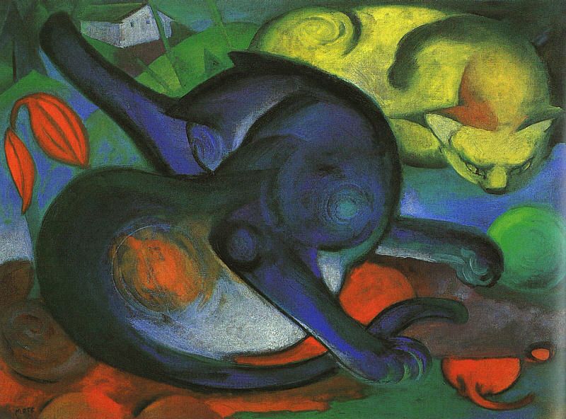
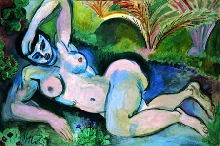
This was my favorite painting: (the picture does no justice):

Look at the colors, lines, textures, shapes: beautiful!


Matisse as a Sculptor

Saturday, June 09, 2007 - Sunday, September 16, 2007 (SFMOMA)

Known primarily for his beautiful paintings, drawings, and works on paper, Henri Matisse was also an accomplished sculptor whose radical style left lasting marks on modern art history. The first major U.S. examination of Matisse's sculpture in nearly 40 years, this exhibition assembles more than 150 works in a variety of media to illustrate his inventiveness, dexterity, and historical significance. Side-by-side presentations of two- and three-dimensional pieces showcase the way themes, imagery, and processes overlapped in Matisse's studio practice, while a selection of works by the artist's peers — including Constantin Brancusi, Paul Cézanne, Edgar Degas, Alberto Giacometti, Pablo Picasso, and Auguste Rodin — provides a vivid context for considering Matisse's oeuvre.

Thursday, May 24, 2007

PrintsPrints

Well, I finally made it to the Eight by Eight: 64 works on paper by eight printmakers. I didn't make it to the opening because my friends had extra tickets to see Bright Eyes which was a disappointing concert. The show was at the Market Street Gallery. Getting there was a bit of a pain because I had to walk through some sketchy neighborhoods, but I was fine. The gallery itself is in a nicer neighborhood, and it is very nice. I was surprised when I entered by how much work was on display. I knew a couple of the artists by their reputation. Leslie Lowinger is a part of the Graphics Arts Workshop which is a printmaking cooperative. I also knew of Amanda Knowles. I like her works from 2007 it seems to me that she has been somewhat influenced by Judy Pfaff. She graduated with an MFA from UW-Madison, and has shown a lot on the West coast. She is also teaching at Kala another printmaking workshop. The prints were mostly organically abstract with beautiful colors. I don't have pictures because I didn't take my camera with me. The work made me feel very happy. After a first and second round I spoke with the gallery owner Ronald Newman. He is also a printmaker and is a funny man. He advised me to go to City College SF to take printmaking classes. He told me it's cheap and that there is a nice group of people who have been printmaking for years. I think I'll take him up on his offer because I really miss being surrounded by serious printmakers. I also like to be around older people because they make me laugh a lot. He told me that the classes are sort of like open studios where one can play around and use whatever technique they like. We had a good chat about how he started the gallery and the fun he has with the openings. A lot of the time I get ignored by gallery owners, but he was so so nice to me even though he knew I would not be buying art. It's definitely a gallery I will go back to many many more times.

After going to the Market Street Gallery I headed to the Farmers market for some fresh fruit and then went to Aurobora Press which specializes in monoprinting. If you've been keeping up with my blog for a few years you might remember that this press is what got me interested in monoprinting which eventually landed me an opportunity in Greece. Jackie Gendel had an exhibition on portraits that were okay. I liked the composition and subject matter, but the technique was displeasing to me. There is a certain color brown and ugly texture that happens when people don't know how to use the ink on the plate and print properly, and this is what happened to her. It's quite strange though. Even though I was internally technically vomitting it somehow drew me more to her work because her portraits were quite disturbing. So, I have an awkward emotional pull to her work like nails scrapping against a chalk board. I'm not sure where I stand. Also, I like to go to Aurobora Press because Kurt Kemp has an awesome large print collage which is just amazing to look at. I really am starting to like his work the more I look at it. I hope to meet him someday. He lives somewhere North of here and I don't have the transportation to visit him, but I'm sure I'll spontaneously run into him someday.

Right now I'm ready Oscars Wilde's A Portrait of Dorian Gray. It's such a great book. I've always known the premise of the story, but have not taken the time to read it. It's a great book for artists to read. "Art is really quite useless"- Oscar Wilde

On another note, there was a Tony Blair special on PBS last night which was so interesting. I was quite shocked when he announced his resignation. I think he is a great man and has done some wonderful things. Unfortunately, he's been struggling since Bush has become President which has become quite damaging to him. I hope someday that he opens upand talks more about his decisions that he has made recently.

Wednesday, May 16, 2007

Royal Temple of Ireland

Ancient "Royal Temple" Discovered in Path of Ireland Highway
National Geographic News
James Owen

Artifacts unearthed at the site include a stone axe head, a pottery fragment, and an ornamental pin. An ancient buried dog was also excavated nearby.

Archaeologists say the monument probably formed part of an important ceremonial complex centred on the Hill of Tara, where remains date back to the Stone Age.

Archaeologist Joe Fenwick of the National University of Ireland, Galway, described the Hill of Tara as Ireland's equivalent of Stonehenge or Egypt's Pyramids.

National Geographic

Artist Proof Studio-Johannesburg, South Africa


My friend Nels is currently in South Africa to observe and learn new printmaking
techniques. He is also there to try an be an liason between Prof. Joel Elgin (our printmaking instructor at UWL) and the local art community in order to set up a print exchange to showcase african art at an exhibition at the university. Exciting stuff indeeed! So, since he hasn't sent any photo's yet, I thought it would be fun to follow him visually on my blog. This way I can feel like I'm there too!

The first printshop he went to see was the Artists Proof Studio in Johannesburg S. Africa. The Artist's Proof Studio relocated (after a disasterous fire in a location across the street) into a refurbished bus manufacturing factory refurbished to be an art center. It has become a "home studio" and resource centre for artists from disadvantaged areas in and around Johannesburg. With its state-of-the-art equipment and expert staff, APS offers intensive training programs in printmaking and organizes exchange programs with local and international printmakers. In 2004, Zuva Gallery partnered with APS to provide top printmaking students premier exhibition venues at Zuva's galleries in Johannesburg and Scottsdale. Each show is launched at Zuva Gallery in Johannesburg and run simultaneously at Zuva Gallery in Scottsdale, Arizona.

APS Mission

The mission of the studio is to provide an environment of excellence for artists to develop printmaking as a democratic and accessible medium of expression.

Artists Proof Press


The South African Development Fund

By the mid eighties, political repression in South Africa had reached new heights. The apartheid government was involved in activities to suppress the democratic movement and in committing the myriad of human rights violations now coming to scrutiny under the Truth and Reconciliation Commission. Thousands of South Africans fled into exile, and the international anti-apartheid movement was established.

The South Africa Development Fund was founded in 1985 by exiles living in the United States to help the oppressed majority of their country. They were joined in this effort by Americans active in the civil rights and anti-apartheid movements. Originally called "Fund for a Free South Africa, (FreeSA)", the organization became a vehicle by which U.S. donors could show their solidarity with South Africans struggling for political and social justice.

South African society has changed, but the legacy of apartheid policies will take many years to undo. Millions of people still live in makeshift shacks without electricity and clean water. An entire generation grew up without a decent education resulting in widespread illiteracy and massive unemployment.

The South Africa Development Fund is working closely with a number of non-governmental organizations that treat social and economic rights as full human rights. The programs have been implemented to ensure that South Africans have the ability to fully participate in the democratic process, the right to a safe and healthy environment and the opportunity to pursue education and employment.


EDUCATION PROGRAMS


Artist Proof Studio, Johannesburg provides opportunities for disadvantaged artists to study printmaking and papermaking in a cooperative environment.


To donate money:
The South African Development Fund

Monday, May 14, 2007

Anne Ryan


The Power of Women of a Certain Age

From artblog by libby
Post by Andrea Kirsh

I saw another eye-opener at Susan Teller Gallery (not far from the Drawing Center, at 568 Broadway, 212 941-7335), a small overview, not quite a retrospective, of Anne Ryan’s work. Ryan is best known for the collages she made after 1948 when she saw an exhibition of Kurt Schwitters’ work. A couple of these used to be on more-or-less permanent exhibition at MoMA, but that was years ago. I haven’t seen them in decades.

Anne Ryan
The Wine Glass, about 1945, woodcut on black paper, 16 x 21 inches.

Ryan only began painting in her fifties and her career was but fifteen years. This exhibition has one collage and twenty-seven paintings, drawings and innovative wood-block prints. It traces her experience in Stanley William Hayter’s print studio and her exploration of Constructivism and Surrealism. While her collages have a clear debt to Schwitters, they have their own characteristic palette and delicacy, and rather than the urban detritus favored by Schwitters, Ryan favored varied types of fabric and fine papers, some of it hand-made. Her wood-cuts employ a single block which she inked by hand, in multiple colors of varying transparency which yielded variation within an edition. She often printed on black paper in another sort of artistic recycling (they were the wrappers from photographic film). This gives the work a striking coloration and depth. The exhibition is on through May 12, and should you miss it, the gallery will likely have some of her work available.

Friday, May 11, 2007

Kathan Brown on Sol LeWitt

Sol LeWitt, whose deceptively simple geometric sculptures and drawings and ecstatically colored and jazzy wall paintings established him as a lodestar of modern American art, died last month in New York at the age of 78.

Sol Lewitt made some of the first prints at Crown Point Press and here is a tribute for him from Kathan Brown from her 3 minute egg series.

Thursday, May 03, 2007

8 X 8 PRINTMAKING SHOW

8 X 8 PRINTMAKING SHOW
Market Street Gallery (1554 Market Street, San Francisco)
EXHIBITION: MAY 1st - 31st
RECEPTION: Friday, May 4th
6:00 PM - 9:30 PM


8 x 8 is a traveling show of works on paper of eight West Coast women printmakers who work in various printmaking media such as Intaglio, Monotype, and Chine Colle. The show will showcase 64+ fresh works in print that incorporate interesting and innovative techniques.

Printmaking artists include Seiko Tachibana, Amanda Knowles, Leslie Lowinger, Susan Belau, Donna Sharee, Ellen Markoff, Sandra Kelch and Terri Driscoll.

This should be a lot of fun to go to. I have heard a lot about some of these printmakers and it should be fun to meet them.

Wednesday, May 02, 2007

Exhibition: University of Wisconsin-LaCrosse and University at Albany

My beloved Professor Joel and his Lynched friend have set up an online exhibit between the two universities of University of Wisconsin-La Crosse and University at Albany. It's a very exciting opportunity for the L.Mob to get together and check out what each other have been doing.

ENTER HERE


While graduate printmaking students at Iowa, Brian Lynch and Joel Elgin, took a course in the Art Museum/ Gallery Theory and Practice. The Prof, who flunked them both had no clue that the future would allow for internet based exhibits. This exhibition brings together Elgin's students from the University of Wisconsin LaCrosse and Lynch's students from the University at Albany . We encourage the students from both institutions to comment on each other's images in order to create a dialog from the East to the Midwest. We encourage any reader/viewer who wishes further information on the exhibit or programs to comment under this post to LynchBaby or Beloved Prof Joel.

For further information on... Lynch please go to: http://www.lynchstudio.com/

Beloved Prof Joel: http://www.gracechosygallery.com/

Please visit the UWL Printfever blog to connect with current printmaking activity and to see the prints of UWL alumni: http://printfever.blogspot.com/

Special thanks to BlogBitch Becca for her hours spent collecting and posting images.

ENTER HERE

Chloe Piene at Lower East Side Printshop


(c) Chloe Piene, 2006
Big Hands
Etching and aquatint
11.75" x 10" image, 17.75" x 16" sheet
Current price: $1,500

Chloe Piene was at the Lower East Side print shop towards the end of last year. I've only seen this one print, so I'm not sure if she made more than one edition. I hope she did.

I get the Lower East Side newsletter, and I'm always excited when I do. Reading it makes me want to go to New York especially to the LES Print shop because it is always buzzing with excitement. They have great opportunities with their on going classes and residences. Maybe one summer I'll take a class there.

More of Chloe Piene's art

Tuesday, May 01, 2007

Put Your Art online

I found a great little website called Carbonmade: Your online portfolio.
It's a great way to get your art put online really fast and for free without advertisements. I like the layout, and it allows enough space for me to keep my work for now.

Some other great services are similar to myspace such as:
Deviant Artists
-a great place to get to know other student artists and make fun connections through art.
Stuart
-set up by the highly respectable Saatchi Gallery. Nels is a part of this, and I think more should join him from LaCrosse.


I'm sure there are others too.

Thursday, April 26, 2007

Alan Moore


I love Union Square in San Francisco. There are about 30 galleries within the radius of a few blocks ranging from contemporary to the good old Mattise, Chagall and so on. When the Great comes, I hope to show her some of my favorites. I've recently been admiring the Chagalls on display. His prints are so beautiful. Also, Miro's prints have struck an interest in me. Today at Union Square in SF there was an art show that I enjoyed during my lunch. The art show was more in the style of an "art fair" that you'd usually see during the summer. The weather here is so beautiful right now it might as well be summer. Anyways, I was walking through the usual still lifes, and kitty paintings when I ran into Alan Moore. His work was so beautful. His website does not even come anywhere close to what his work is like in person, but it is so beautiful. It reminds me of wabi sabi pottery from Japan. It's very spiritual and playful. I talked to him for a while and found out that the way we approach art is very similar. He didn't have any fancy words and didn't go to a fancy art school (he's not even a trained artist), and I found that very refreshing especially for the Bay Area. I think he's a genius, and if I had a gallery, I would have picked him up in a heart beat. This painting above was one of my favorite smaller pieces. I wanted to buy it, but I'm to po'. I think he'd like monoprinting a lot, and was trying to convince him to take printmaking, but I think he thought I was talking about Giclee prints. Anyways what he does he does well in his chosen medium.

Alan Moore

Monday, April 23, 2007

Julio Valdez


Julio Valdez's printed oeuvre attests to the significant role that printmaking can play in artist's career. Since1988, Valdez has made nearly 50 editioned prints, at least as many related proofs, and over 100 monotypes. His experimental mixture of techniques and openness to new processes continue to expand his creative program and the technical range of his work in all mediums.


Check out Julio Valdez website. It has a force of its own!


Essay: Surface and Symbol:Julio Valdez and the Printed Image

Thursday, April 19, 2007

Printmaking position

WINONA STATE UNIVERSITY
PO BOX 5838
WINONA, MN 55987

RESPONSIBILITIES: Fixed-term Instructor or Asst. Professor to teach Art Foundations, University Studies and Printmaking. Art Foundations includes 2-D Design and Drawing I. University Studies includes a large enrollment Experiencing Art or Intro to Art as well as a Drawing course designed for Science majors. Additional responsibilities may include Gallery Director and/or teaching Graphic Design. Normal teaching load is 12 credits per semester. Participation in Departmental responsibilities expected. Rank and salary commensurate with experience.

QUALIFICATIONS: MFA in printmaking and at least two years full-time university teaching experience beyond graduate assistantship (or teacher of record). Possible renewal of this position beyond one year.

Thursday, April 05, 2007

Print Zero Exchange

Print freaks...time again to get ready for the annual print zero exchange!!!!

Hello Printmakers,
It's time for the annual Print Zero Studios Print Exchange #5.
Last year we had 285 printmakers from 18 countries participate,
and the show traveled to 4 states. We thank you for your past
participation and hope that you will once again take part.
Now onto the prospectus.


PRINT ZERO STUDIOS - PRINT EXCHANGE 5.
Welcome to the Print Zero Studios Print Exchange V.
At this point we have at least 2 confirmed exhibitions.
Thank you to the Florida Printmakers who will be hosting
at the U of Miami. Thank you also to Sev Shoon Arts Center
and BallardWorks who will be hosting in Seattle.

GUIDELINES
All prints will conform to the following guidelines, any prints that
do not fit these criteria will be returned to the artist (No Exceptions).
- Prints must be created with an original printmaking process
(etching, litho, silkscreen, woodcut, etc…NO strictly digital prints)
- Paper size of 5"x7"
- Edition of 15 prints (Print Zero Studios will keep 2 prints from
each edition for archiving and exhibition)
- There is no assigned theme
- Submission Fee of $5.00 (US participants) $7.00 (International participants)
This will cover return shipping costs, we will provide postage/envelope.
- Submissions must be RECEIVED by June 15, 2007

Ship prints to:
Print Zero Studios
Attn: Brian Lane
323 North 105th Street, A-2
Seattle, WA 98133
Check the website for updates and information. You may also download
the prospectus and view previous print exchanges.
http://www.PrintZeroStudios.com

Cheers,
Jeremy Cody - printzero@gmail.com
Brian Lane - printzero2@gmail.com
Lisa Hasegawa - ilfant@yahoo.com

Thursday, March 29, 2007

Summer Workshop in Skopelos, Greece


Clay Mono-prints with Mitch Lyons
- August 1st - 15th


As you know I went to Skopelos, Greece last year for a printmaking workshop. I would go back in a heart beat. Not only are the facilities of the printshop wonderful, but Jill and Gloria are wonderful people who took time out everyday to ask us if we were doing alright and made us frappachino's. The workshop is on a beautiful Island with beaches and mountains. It's a truly magical experience!


This is a once-in-a-lifetime opportunity to study a printmaking method developed by the instructor himself, Mitch Lyons. Students will create their prints on clay and then transfer the print on to paper. This is an excellent way for ceramists, painters andprintmakers to explore new techniques. Costs to include opening/closing dinner and breakfasts is $1,400. Price does not include housing. An early bird special is offered by registering no later than April 30th.....more

Mitch Lyons

Skopelos Print Shop

Summer Workshop in Spain

A Two-Week Solar Printmaking Workshop
with Maureen Booth in the Andalusian Sun


You'll be taken with solar-plate printmaking; everybody is. This two-week intensive workshop with Maureen Booth in solar-plate techniques also includes some innovative relief techniques based on liquid metal.

Studio located in Sierra Nevada foothills, river below with nightingales, wonderful area for walks and sketching. Riverside walking/bike path goes all the way to Granada, also frequent bus service.

Sun, sun and more sun...

Wednesday, March 28, 2007

Katarina Vavrova


Katarina Vavrová is a very talented painter and graphic artist from Slovakia. Her work is highly poetical, imaginative, dreamlike and very suggestive. The quality of detail and draughtsmanship is extraordinarily well visible. The motives have their roots in literature and arts, historical events and persons. One can see traces from biblical events and from the time of the great discoveries, but also something from the outer world and something from the inner parts of the human soul. In her work the world of fantasy melds with reality, dream with actuality, and desire with experience.
Typical elements in her work are people, animals, men with wings, some hats or headgear and something in red colour. In many of her pictures we see a lady with a sad contemplating expression on her face.

The many prizes and awards received by Katarina Vavrová and the number of private an group exhibitions she has had, do prove that her art is of the highest quality.

Vavrová is born in 1964 in Bratislava, Slovakia, and today she lives and works in Pezinok which is nearby native town.

-more prints

Monday, March 05, 2007

Paul Wunderlich


While I was farming in Italy, I came across a book of an exhibition of artists who created kites. Paul Wunderlich was one of the artists, and I fell in love with his work after doing some more research on him. Some surprising information I found out was that Horst Janssen switched from lithography to etching as a pupil under Paul Wunderlich and later regarded Wunderlich as a rival. How surprising that these two are related. I can definitely see the resemblance, but some how I'm more drawn to Janssens work, but yet I like the surrealist aspects of Wunderlichs work. This is fantastic information to me! I need to find out more about this relationship.


Painter, sculptor and Printmaker

Wunderlich studied at the Hamburg Academy and after a three year stay in Paris returned to Hamburg to be Professor of the Art Academy there. He now lives and works in Hamburg and for part of the year in France.
His early work was in an "abstract-figurative" style, but in the sixties he adopted a more symbolist, even surrealist style. He painted and printed many images taken from the fine photographs by his wife, Karin Szekessy He has held many major exhibitions world wide and has won innumerable International prizes, particularly for his colour lithography. He has been immensely prolific and has a vast oeuvre of prints, paintings in many media, sculpture, jewellery and furniture design. His renditions after classic paintings by artists such as Dürer, Ingres and Rembrandt show his inventiveness


Red Fern Gallery-drypoints
The Hart Gallery-sculpture, lithographs, and painting.
Gallery Brockstedt-prints
Limited Editon Graphics-prints


-

Friday, March 02, 2007

woodblock

I'm embarking on a new adventure. I'm teaching myself how to do woodblock printing using Gabor Peterdi's methods. I didn't remember that he had a section in his book about woodblock printing until I was searching through it yesterday. I really like his instructions and I think it will be enough to get me started. So, I went out and bought some materials that I didn't have which was a lot of fun. I usually despise shopping, but getting art supplies is always fun. I bought some cheap woodcut tools because I didn't find any that I liked. I'll probably have to order them online. Besides I wanted to make sure I liked this process before I spent a lot of money on things, but maybe that's the wrong philosophy to start a hobby with? Since I don't have a car getting wood is very hard. I had to bike a long way to my favorite store in the whole wide world Home Depot! Actually, I hate this store with a passion. I got some strange ink called adigraf ink which is waterbased. I'd rather work with waterbased ink since I'm working at home with a crazy cat who'll eat anything. The ink smells like acrylic paint and is a bit glossy, but I'll give it a go when I get to that point.

I like Gabor Peterdi's book because the way he writes is as if you were in the classroom with him. He offers some fine suggestions on mistakes that his students have made, and offers a lot of advice and philosophy on how woodblock printmaking should be approached.

The project that I am taking on that I have been thinking about for years now is tarot cards. I've been doing readings for myself for six years now, and I'm still fascinated in the imagery of the cards. Ever since I heard that Salvador Dali created his own set, I've wanted to do it. There is a challenge that has been proposed by my Prof.J to find the earliest print in western civilization. I have looked and looked and cannot find one that dates earlier than the 1423AD woodcut of St. Christopher. On my searches I came across some information on suggestions that the earliest images on woodblock besides religious iconography could have been a deck of cards, but nobody has any images of them. Cards were banned by the government soon after they were widely distributed using woodblock, so I'm sure a lot of them have been destroyed.


I stumbled across Salvador Dali's woodblock/etchingsand realized that I had never seen these images before. There are wild and creative. I really like these a lot more than I his oil paintings. These images are so fresh and free I can't help but compare this work to a lot of art I see in the contemporary galleries in San Francisco. I went to the Dali museum which is located outside of Barcelona. It's a really great museum if you have the chance to visit it. It's in a really small town which has devoted itself to selling Dali trinkets. I really was amazed by how much work Dali did in his lifetime. Forget having a solo show this guy has floors and floors of work in all mediums. It's really inspiring to be in there.


Friday, February 23, 2007

Things a changin' 'round 'ere

Check out the new print pod with short videos of printmakers, techniques and exhibits.

Blogger is now new and improved. I like the new additions to the new blogger. I finally get to add labels which was my biggest complaint of all. Plus now they have new fun"widgets" to add and I love that blogger and Google have merged (even though I oppose merging). I like googles feature, reader labs, which allows me to receive updates from all my favorite blogs onto one area so that I don't have to keep looking for updates on blogs all the time. I also like that I can post blog articles that I liked to the side bar. I even went so far to update more links on the side bar. I'm done with adding all the US print shops, I've added a couple of Canadian shops but there are a lot more. Soon I will do more, but I'm really tired. I learned a lot about the Canadian territories which I knew so little about before.

Hey I just felt an earthquake. I've been feeling them a lot lately.

I had a lot of fun looking at all the websites for print shops. Some are really badly designed, but a lot of them are really cool to look at. I'm surprised by how many Print shops are in California, Texas, and New Mexico. Wisconsin looks very sad, actually the Midwest looks sad-I wonder why there aren't anymore, but there are so many states that don't even have one print shop. New York has a lot of print shops, but that doesn't surprise me non. There are a ton of print shops in England. A lot of them don't have websites so I didn't add them. Perhaps I'll add them in the future when the Internet becomes more a part of British life and when it becomes more economical.

-Happy Printing y'all

Tuesday, February 20, 2007

Magical Secrets about Line Etching & Engraving: The Step-by-Step Art of Incised Lines

Available March 27, 2007

It looks like Kathan Brown of Crown Point Press has written another bookMagical Secrets about Line Etching & Engraving: The Step-by-Step Art of Incised Lines. This time it is more about technical skills rather than creative thinking (Magical Secrets about Thinking Creatively: The Art of Etching and the Truth of Life). I was browsing through Crown Point Press summer courses and would love to take and etching workshop. I really don't know what my schedule will be like this summer, so it's hard to plan for it. I guess it's sort of hard to get into the workshops. They select people by pulling their names out of a hat. One of the printmaking professors from CCA actually used to work at Crown Point Press, and he does things a lot differently from the way I've been taught. I'm a get down and dirty printmaker while he was a more orderly, scientific printmaker. Still I would love take a class and use the facilities.

Magical Secrets are sudden flashes of insight that help you make sense of something you care about. If you care about etching, engraving, and drypoint (a form of engraving), you will find revelations here. Author Catherine Brooks is a master printer at Crown Point Press, printers and publishers of etchings since 1962, and she draws on the venerable history of that institution to create an inspirational and highly usable how-to book. Crown Point Press founder, Kathan Brown, adds an appendix on hand-wiping and printing that teaches you to ink and print etchings with Crown Point’s superlative quality. The practical information is artistcentered, with illustrations and discussions of line etchings and engravings enhanced by quotations from the artists who made them. The book includes a DVD on which Catherine Brooks and Kathan Brown demonstrate the processes and artists are shown using them. On the accompanying website, you can join others in discussions and find ongoing information and ideas to increase your pleasure in the printmaking world.

Monday, February 19, 2007

Top 10 Grad Schools for Printmaking

According to U.S. News the top ten best graduate schools for printmaking are:

1.University of Wisconsin-Madison

2.University of Iowa (#1?)

3.Arizona State University

4.University of Georgia

5.University of Tennesee-Knoxville

6.School of the Art Institute Chicago (pardon moi...printmedia)

7.University of Texas-Austin

8.Cranbrook Academy of Art (MI) (excuse me...print/media)

9. Rutgers State University-New Brunswick New Jersey

10. Rhode Island School of Design

Lisa Kokin


Lisa Kokin is a bay area artist of whose work I really like. I especially like her book collages. If there was ever a way of showing you what hip bay area art is, it would be this lady's work. I have been noticing for a couple of years now that the most fashionable art is made up of junk from thrift shops.
You have to check out her webpage because it is one of the best artists web page I have ever some across.


"In my never-ending quest to find different ways to eviscerate books, I stumbled upon the book collage. First I find a book which interests me, either for some element of text, image or marginalia, or for the look of the book itself. Sometimes I remove some of the pages and glue and/or sew the book open to the particular page of interest. Other times I remove all the pages and use the inside covers as the collage surface. I build upon what initially interests me by layering images and text from the same or other books, found photos, and other small objects, using a variety of collage and transfer techniques. Often I scrape away and dig into the surface as well. Many of the books have sculptural protrusions and extensions because I feel that the shape of books shouldn't be limited to a rectangle"-Lisa Kokin

Sunday, February 11, 2007

Animals in Art


"
I am trying to intensify my feeling for the organic rhythm of all things, to achieve pantheistic empathy with the throbbing and flowing of nature's bloodstream in trees, in animals, in the air."

Franz Marc
was born on February 8, 1880
Me was born on February 8, 1980

Besides Franz Mark and I having a similar birthday, Marc was an influence to me as an undergrad. He was introduced to me by Prof. Joel Elgin as one of his most influential artists.

Franz Marc is best known for his paintings of animals in non-realistic hues, such as blue and red horses, believing that color had a symbolic and spiritual force all of its own.
Blue is the male principle, astringent and spiritual. Yellow is the female principle, gentle, gay and spiritual. Red is matter, brutal and heavy and always the colour to be opposed and overcome by the other two. He liked animals and saw in them innocent beings in harmony with nature. He wanted to paint the world out of the perspective of the animal. Marc was a very sensitive and spiritual man. Today, only hundred years later, it is not quite easy to understand the ideas of this artist and others, although they were documented in articles, books and letters. He met Kandinsky and joined the New Artists Association from which his Expressionists group Der Blaue Reiter later evolved. His work had a mixture of Romanticism, Expressionism and Symbolism
Associated artists: R. Delaunay, Gleizes, Gontcharova, Kandinsky, Kirkeby.


William Wegman makes playful photographs which provide a wry and sophisticated commentary on the absurd elements of contemporary life and human behaviour.


Mark Dion is one of the leading contemporary artists whose work is about animals.
Using props from the natural and man-made world , Dion has constructed an installation that explores contemporary attitudes to science and the environment. He has created a fictional and hybridized situation in which the trappings associated with knowledge, learning and classification-such as books and photographs-are juxtaposed with natural elements including birds and wood. The representation of nature is a fundamental subject in Dions art, and here he takes the role of sociologist/anthropologist and blurring the boundaries between authentic and fake, representation and parody. Dion questions the values of the Western world.
Haunted by the Animal:An article on
how Art is continually haunted by the animal.


Arthur Dove liked to paint bulbous forms in strange landscape fantasies while simultaneously resembeling animals and abstract shapes.


Paul Urich 2005


Kiki Smith


Amy Ross 2006

Going Ape: Confronting Animals in Contemporary Art


Going Ape is not the only, first, largest, or last exhibition on the theme of animals in contemporary art. Such shows have appeared throughout the country with increasing frequency over the last several years. This trend reflects two complementary phenomena: a growing set of artists who address animal themes in their work, and an avid audience for animal imagery. Everyone seems to be “going ape” for animal art.

This should come as no surprise. The history of art teems with animals, and may indeed have begun with images of beasts painted on the walls and ceilings of caves. Since that time, animals have appeared in the visual arts in everything ranging from decoration to symbols and allegories. The current interest in animal imagery, as expressed by both artists and viewers, seems intensified by our increasingly uneasy relationships with the natural world and its denizens. Our positions vis-à-vis animals are marked by confrontation and confusion. We gaze with wonder at them in the zoo, yet try to avoid them on the street. Meanwhile, our pets are practically people, since we ask them to be life-long companions and child surrogates. People don’t seem to know animals well anymore, or understand what our interactions should or could mean. This anxiety informs most of the artwork in Going Ape as artists try to find ways to figure out what it means to be animal, human, and both simultaneously.

Among the several themes that run throughout this exhibition are a questioning of the age-old wild/tame dichotomy and a confused duality between human/animal. Artists also use animal imagery to express anxiety and guilt about the wide variety of crimes perpetrated against animals and nature by our own species in the name of Science. But not everything is doom and gloom. Many of today’s artists, like artists throughout history, create images of animals to celebrate their sheer beauty of form, shape, surface, and variety, as well as their animating spirits.

So, even though the art in this exhibition is ostensibly about animals, it’s really all about us: what we think and how we feel. We ultimately confront animals to see ourselves.

Going Ape also heralds the planning, fundraising, and implementation of the Sculpture Zoo, the third phase of DeCordova Museum’s master plan. The Sculpture Zoo will be an area within the Sculpture Park permanently dedicated to the display of contemporary animal sculpture—a new opportunity for children and families to learn about the art of our time.

Going Ape includes work by the following artists:

* Deborah Brown
* Catherine Chalmers
* Walton Ford
* James Grashow
* Catherine Hamilton
* John Harden
* Henry Horenstein
* Mary Kenny
* Vitaly Komar & Alex Melamid
* Neeta Madahar
* Barbara Moody
* Josie Morway
* Gwynn Murrill
* Frank Noelker
* Barbara Norfleet
* Shelley Reed
* Amy Ross
* Peter Smuts
* Brad Story
* Kitty Wales


Saturday, February 10, 2007

Audrey Niffenegger

You have to check this womans work out:
Audrey Niffenegger


The month of January was productive in that I got a lot of reading done. A way to escape my personal problems, I buried myself into "The Kite Runner", "The Memory Keepers Daughter", "The Curious Incident of the Dog in the Night-time", "Eighty Acres", "Middlesex", "Running with Scissors", "The Secret Life of Bees", "The God of Small Things", and "The Time Travellers Wife" by Audrey Niffenegger. I'm a complete sucker for time traveller books, and I loved this book. The main character is an artist who struggles through life using art as a medium to make sense of it. There are a lot of references to artists, museums, galleries, and also a lot of art school jargon which at times got on my nerves. Anyways, I was reading the biography on the back of the book about Audrey, and found out that she is a professor in the MFA program at Columbia College Chicago Center for Book and Paper Arts. After doing research on the school, I realized that what I love is bookmaking. I am completely fascinated in the process of composing a work of art using image and text. I love the process of making books, and I'm completely fascinated with different papers. I love the idea of creating etchings, woodblock prints, letterpress, lithographs, collage to create a body of work the ties together secretly. I love how intimate the experience of opening boxes and covers of books is. The feel of the material, the turning of pages, the build up of anticipation. The book doesn't have to be bound but turned page by page. The book can hang like a sculpture, hide like a private locked box, it can be coded and abscure, it can be mutilated misused. The process of thinking about making a series of prints with or without text in a book format has unlimited posibilities.

One bookmaker I admire is William Blake. This guy was completely possessed and it is said that his wife often helped him color his prints. I'll be looking more into this guy in the future. Aparently there is a book collection near LA which has a copy of one of his books, but you need special permission to see it.

Like a complete dork, I spent my birthday going to museums and galleries, and while I was in SFMOMA bookstore I noticed Audrey Niffenegger's graphic novel the
"The Three Incestuous Sisters". This book tells the story of three unusual sisters who live in a seaside house. Because of the artwork and mood, the book has been compared to the work of Edward Gorey (another favorite of mine). I started looking through the books and was completely amazed by her etchings.


So who I want to be when I grow up: a little bit of Audrey Niffenegger for her ability to write an awesome novel and create art; Kiki Smith for her ability to always be inspired and making things and have the coolest hair, Joel Elgin for his ability to inspire and create greatness, Betsy Davids for her calm wisdom, William Blake for being crazy, Kathy Neckar for her ability to keep her child-like curiosity, and love for life, Jon Stuarts humor, and Conan O'Brians ability to make me laugh out loud for being Irish.

Thursday, February 01, 2007

INTERNATIONAL PRINT CENTER NEW YORK


Dasha Shiskin "Sausage Princess Dies and What it means for the Folks", 2005 Etching. Edition of 400, 18 x 24 inches
INTERNATIONAL PRINT CENTER NEW YORK
NEW PRINTS 2007/WINTER

Glad to see that IPCNY winter prints are up for viewing. It's always interesting to see what is "hip" with the "Art/Print" world. A great aspect of this web page is the ability to know who actually makes their own prints and who goes to a press to get them published. Even though you all know my preference is of course for prints made by printmakers, I still like to see how close printers get to making the prints look as close as possible to the artists original work.

My favs are:
Ghada Amer, Enrique Chagoya, Nicholas Conbere, Robert Creighton, Klara Glosova, Daniel Heyman , Yuji Hiratsuka- (this guy is everywhere), Meejin Hong, John Jacobsmeyer, Max Liboiron, Serena Perrone, Carrie Scanga(really liked a lot), Dasha Shishkin(one of my favorite upcoming artists), Kiki Smith (never fails to dissapoint).

People who I wish would go away: Kota Ezawa...well he's the only one I really know about and I wish his work would go away...some people just know how to play the game right.

A lot of the other artists I don't know, and can't guess by looking at their work what they are trying to say, and quite frankly don't care enough to do research about it.


Woodblock Dreams

Final Print: Raping Darfur
I was browsing the the printblogs and wanted to point out to you, if you have not yet seen it, Annie's final woodblock print which is an extremely strong print that you have to check out. Also, she shows the process that it took for her to get to the final print.


Los Angeles Printmaking Society 19th National Exhibition

Deadline: February 10, 2007

"Los Angeles Printmaking Society 19th National Exhibition" call for entries
(Posted: 1/9/07) -- The Los Angeles Printmaking Society announces a call to artists for its 19th National Exhibition, held September 15 - October 28, 2007 at the Riverside Art Museum (Riverside, CA). Open to USA and Canadian printmakers. Original work in all printmaking media. LAPS will not consider traditional photography, off-set reproductions, or art originally produced in other media. Awards: $3,000 minimum, last national garnered over $5000 in awards. Juror: Archana Horsting, Executive Director of Kala Art Institute. Deadline: February 10, 2007. $30 for 3 slides or $35 for 5 slides. For more information visit http://LosAngelesPrintmakingSociety.com or send SASE to: LAPS 19th National, 3836 Mentone Ave #4, Culver City, CA 90232. Questions? Please contact Nancy Jo Haselbacher at nancy@indeliblepress.com or call (310) 633-0296.